Storefront Sign Renovations at Shopping Centers

Strip Malls, Shopping Centers need Design to Survive

June 27, 2013 by The Gaines Group – Harrisonburg Studio

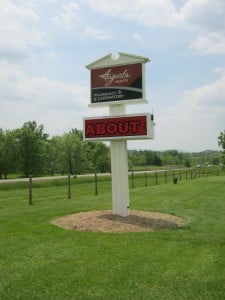
Storefront sign renovations at shopping centers seems to be a hot topic in Virginia. At Holiday Signs, we seem to always have a shopping center sign rehab in the shop. It reminds me of the nurse at the plastic surgery section of the hospital telling her friends about all the patients waiting around for their new looks! We have lots of sign “patients” in Chester awaiting renovation.

I recently ate a hearty breakfast at the newly renovated Holiday Inn off I-81 in Staunton with my friends from the Greater Augusta Regional Chamber, where we discussed economic development in Augusta County, Virginia. Joining me at the table was Charles Hendricks, an architect with The Gaines Group, with offices in Harrisonburg and Charlottesville, VA.  I’d like to re-post his recent blog about a topic of interest for developers:

A great shopping experience begins with a developer, a parcel of land, and an idea.  Modern “car-friendly” strip malls became popular in the early 1920′s in the United States. The primary focus was a large parking lot with “anchor stores” to attract the customers all to one easy convenient location. This model has not really changed over the years yielding many neighborhood centers where you can easily get your groceries, a few odds and ends, and occasionally a locally owned restaurant. These car friendly destinations offer a huge value as neighborhood centers – the problem is that is not how they were designed. They do not serve as neighborhood centers, but rather offer very little value to the neighborhood or to the shopping experience. Those that are not adapting are slowly dying leaving large swaths of parking lots, empty storefronts, and developers wondering how to turn things around.

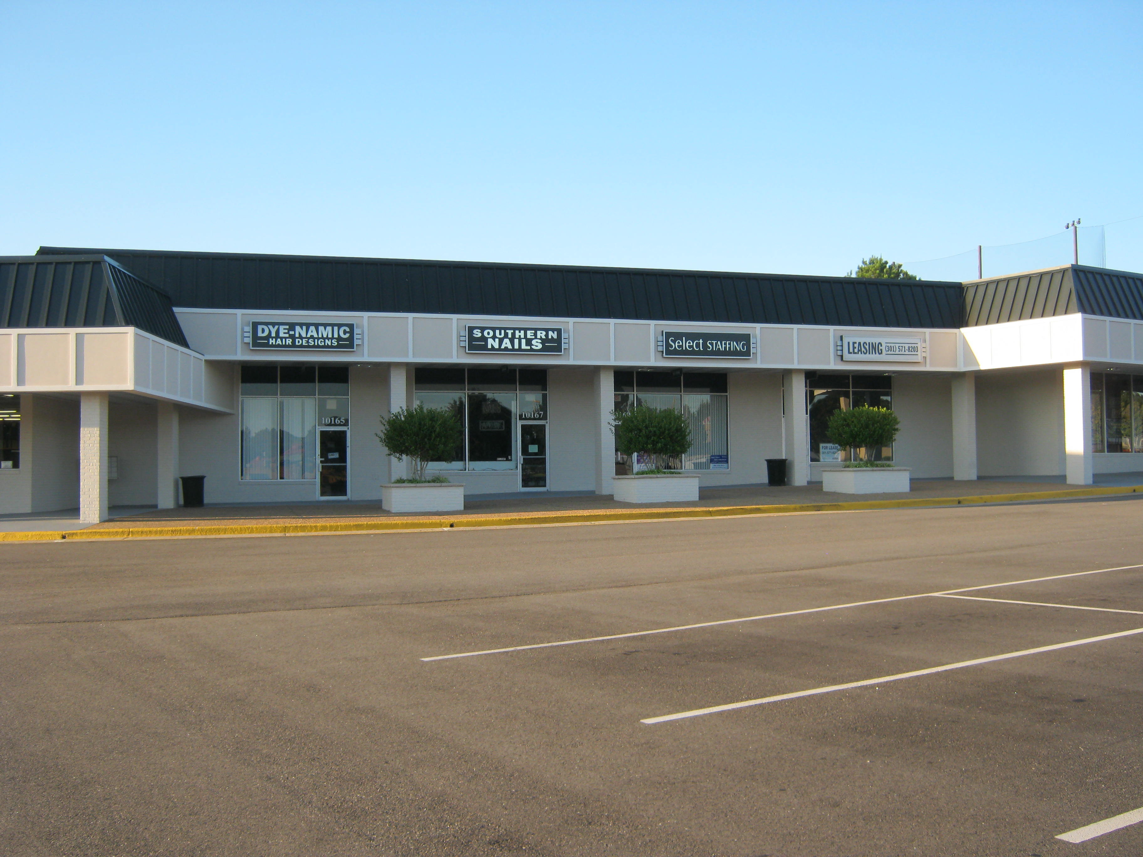
There was never much attention paid to the architecture of these strip shopping centers. The stores (and their signs) were left to figure out how to attract customers through marketing louder and louder. Convenient car parking ruled the day and kept the storefronts filled. The idea of designing a center that allows for layers of discovery and separation from the parking  was not considered. Pedestrian circulation we ignored as well as alternate forms of transportation. Stores are narrow and deep with no natural light.

We are now seeing developers that are focused on making the shopping experience more than just an anchor store and convenient parking. Attention to architectural details, outdoor gathering spaces, landscaping, and breaking up the parking into pedestrian friendly zones are bringing some shopping areas to the front as destinations. Customers are seeking out places to go where they can have a good experience. It is up to the developer to start that impression from the time the customer arrives at the shopping center to the time they enter the store / restaurant. This is impacted directly by design. Just slapping traditional elements on a “big box” is not enough. Careful thought and planning is required to make your project successful.

Your brand is more than your advertising. It should be reflected in everything associated with the company, including the physical spaces. By regularly auditing your building storefronts, you can ensure that your message is consistently and efficiently hitting your audience. Upgrading existing strip buildings and their parking areas, lighting and signage can reduce frustration, increase customer satisfaction, and help everyone feel safe and secure at your commercial property—thereby associating these qualities with the overall brand of the center and the individual brands of the tenants. Yes, storefront sign renovations at shopping centers is a smart thing to explore.

Have architectural design elements and signage at your retail property ever impacted your brand experience? Let us know in the comments. Thanks to the Gaines Group for this great article!


YOU MUST SEE THESE ARTICLES:


Architects Guide to Push-Thru Letters


Case Study: Renovation at Shopping Centers


Storefront Sign Renovation at Shopping Centers


4 Examples of Successful Electric Sign Upgrades


HOW CAN LIGHTING TURN TRAFFIC INTO CUSTOMERS? A Look at Sign Illumination Choices

www.holidaysigns.com-richmond-va-channel-lettersHOW CAN LIGHTING TURN TRAFFIC INTO CUSTOMERS?

A Look at Sign Illumination Choices

Red, Hot & Blue uses open neon tubing to attract hungry passers-by.

Red, Hot & Blue uses open neon tubing to attract hungry passers-by.

“Signage communicates through both conscious and non-conscious processes. Indeed signage may not only convey information and impressions – it may even persuade through non-conscious processing of design attributes,” says a recent University of Cincinnati study by Dr. James J. Kellaris and James S. Womack. This means the color, shape, size, and overall “personality” of your signs become major influences on people’s perception and recognition of your brand.

It is important to remember your signage is a 24-hour marketing tool that acts as your company’s personal sales representative as it makes first and hopefully lasting impressions on those who interact with it visually. Considering their high-profile street locations across Virginia and North Carolina, many of our clients realize this fact and have made investments in enhanced sign lighting effects netting positive results.

According to the American Sign Museum in Cincinnati, the first known illuminated sign dates back to 1840 when P.T. Barnum’s Museum was advertised by a gas-lit display. Gas lighting continued to be used by theaters, drug stores and other retailers until the electric lamp was introduced in 1881. The first electric signs used incandescent bulbs to make graphics similar to the way electronic LED signs do today. In 1910, the Great Chariot Race Sign in New York City was one of the most famous electrical displays in the world featuring a Roman chariot race simulating the movement of horses, drivers and whips at 2,500 flashes per minute and attracting crowds every night for years.

The bright Open-Face Neon letters in Bruce’s Body Shop are perfect for service shops


Neon lighting was developed in 1902 by a French scientist named Georges Claude. It was a popular choice for illuminated signs in the twentieth century and still is today. Although LED lighting has replaced many previous neon applications in signs due to costs of power and maintenance, there are still applications where neon is the best choice, making aesthetic statements that LED cannot achieve. Many restaurants choose open-faced neon channel letters and logos for their on-premise signage because neon lighting is bright, rich in color and creates a clean, crisp and inviting image. Neon or LED striping can also be implemented as borders on buildings and around traditional box signs for attention-grabbing effects.

Today there are many choices for electric sign lighting and special effects. To portray a sense of quality, distinction and high value, some clients choose backlighting for their signs. This is where channel letter faces are constructed of a solid material and the lighting installed within the lettering bounces off the wall producing a halo effect. Fink’s Jewelers, a regionally-focused, multi-location retailer based in Roanoke, Virginia, chose LED backlighting for wall mounted channel letters in the example below.

Fluorescent lighting comes in both warm and cold tones and is traditionally used in sign cabinets with translucent faces. For special effects, the backgrounds can be opaque where only the lettering lights up at night. Similarly, the lettering can be raised from the background to create edge-lit push-thru graphics.

Back-lit Channel letters in Fink’s Jewelers produce a sense of quality, distinction, and high value

There are many ways to stand out among the crowd. One way is to influence buyers through special lighting effects. Holiday Signs has an experienced staff of designers, fabricators and installers who can produce effective custom lighting for your particular marketing application. For over 30 years our project managers have been involved with helping clients create just the right image to turn traffic into customers who understand your products and services before they walk through the door based on successful sign communications!

Contact: Mark Hackley, Account Executive mhackley@holidaysigns.com (540)416-3154


 printer friendly icon


Healthcare Communications – Augusta Health

www.holidaysigns.com-richmond-va-daktronics-watchfire-digital-LED-signsHealthcare Communications – Augusta Health Pharmacy & Lab

Fisherville, VA

hospital-main_entrance-150

Augusta Health, a privately owned and operated healthcare provider based in Fishersville, Virginia expanded its services by relocating its in-house pharmacy and laboratory to a site off campus with high traffic count and visibility. The building that would become the new pharmacy/lab was previously a bank. The hospital selected Holiday Signs to provide their new branding, wayfinding and digital messaging signage based on our past relationship and experience with helping the hospital with similar building conversion projects in connection with their off-campus expansion strategy.

The hospital administration and marketing staff were most concerned in having a remote system that could be updated and controlled from a central point in the main hospital offices. They were interested in a flexible yet secure system that would allow them to easily add new messaging signs as they continued to expand and market their services into other high visibility areas across the Shenandoah Valley Region.

Augusta Health EMC Picture

Working closely with Daktronics Inc., Holiday Signs was able to provide a digital messaging option with the architecture needed for growth. Venus 1500 Software was installed on two computers and messages can be relayed to any number of signs within the hospital’s secure network just as they would communicate with printers, fax machines, or other electronic devices on the system.

An antenna was installed on the sign that picks up signals from a transmitter inside the pharmacy that receives data from the marketing department. The sign has become an important communications tool and the hospital now has the means to capture the attention of a very captive audience year-round.

Contact: Mark Hackley, Account Executive mhackley@holidaysigns.com (540)416-3154


Printable PDF


Other Articles about Electronic Message Center (EMC) Projects:

Case Study: Towne Center West’s Digital Advertising Sign

Case Study: Green Top Sporting Goods’ Electronic Message Center on I-95

Using Co-op Dollars to Fund Digital Signage

Using Digital Signs to Connect with the Community

10 Reasons to Upgrade to On-Premise Digital Advertising

How Fresh Is Your Content?

How Fresh Is Your Content?

stale

We’ve seen them. Pictures on someone’s blog of a business advertising snow shovels in June or wishing you a happy Easter in August. But fresh content goes far beyond just making sure that what’s on your sign is relevant to the time of year.

So, what do we mean by fresh content? Sure, that oil change spacial has been up there for 2 years, but I’m still offering the special, right? Besides, that’s the same blue and yellow background I use for everything!

It’s easy to get into a rut by using the same fonts, backgrounds, graphics… Even the same specials. As passing motorists get used to seeing your sign, it tends to lose some of it’s ability to attract their attention. Especially if it’s the same basic color and shape of yesterday’s sign.

It’s good practice to sit down and take a good long look at your digital messaging at least once a year. Ideally, you would want to look at your messaging before the beginning of your busy season and again after the season to find out the effectiveness of messaging in achieving your goals.

Digital Message Centers are advertising. Would your business keep running a radio ad from last year just because you can’t think of anything better to put out there?

fresh

The first step in evaluating your message center effectiveness is to review your communication goals. We have to know what the sign is supposed to do before we can judge how well it’s doing it. Here are 4 basic goals you might start with:

  • Capture the attention of the audience
  • Convey information to the audience
  • Motivate action by the audience
  • Encourage repeat viewing by the audience

This is as basic as it gets: Are we getting the audience’s attention? Once we get their attention are we communicating our message efficiently? Are we converting that into action? Are we giving them a reason to look at our sign again in the future?

If your content is fairly static, choose one day from the last month and look over all of the messages that you displayed. Carefully look over the content and ask yourself the following:

  • Does the message present the information stylishly and succinctly?
  • Are we using good design rules when creating these messages?
  • Does content flow well from one message to the next?
  • Are messages consistent enough to convey brand identity while being varied enough to grab audience attention?
  • Are customers paying attention to our messages?
  • Are our messages influencing customer behavior?
  • Are we measuring the success of our messages?

One of the most challenging things to do is to present messages in such a way that the branding is consistent, yet the content is varied enough to continue attracting attention. One of the easiest ways to achieve this is to sit down and come up with sets of visual elements and backgrounds that work well together and rotate them on a regular basis.

Don’t confuse stale messages for continuity. Even you standard themes need to be updated periodically.

We recommend at least 4 themes for your sign that can be rotated quarterly as the season changes. Even adding seasonal elements to your current backgrounds and colors can do wonders for keeping your content relevant. Ideally, you should have 10-12 themes and change them out regularly for maximum impact.

Are you measuring the effectiveness of your digital reader board? It’s shocking the number of customers we work with who are unsure if their investment is effective or not. A simple way to determine the effectiveness of your messaging is to run promos on the board only and measure response.

Getting your customer’s attention is only half the battle. Keeping their attention is a constant battle that must be fought with hard work.