How Sign Viewing Angle Effects Sign Readability
Channel Letters: Effective versus Ineffective Design
Part 2- Consideration of Sign Viewing Angle

Horizontal Viewing Angles of two stores. The store on the left utilizes fewer words and uses a wide-stroke font that makes it much clearer than the other example as customers approach from either side of the store entrances.
The simple design elements of “wide strokes” and “getting to the point” are in a nutshell, part of the formula for good, readable channel letters. If a store is located in a strip mall with an internal parking lot off the main road, then sign viewing angle considerations in channel letter design should be considered to effectively keep the traffic’s attention as it approaches the store. Unfortunately, many times a store sign becomes unreadable at wide angles.
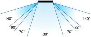
The term “viewing angle” in sign design these days has different meanings depending on the sign media you’re talking about. When talking about channel letters, we can define sign viewing angle as the area where people can effectively read a set of letters. Illuminated letters may have a different viewing angle in the day from the viewing angle at night, and it is always a good idea to take a look at other signs in your commercial neighborhood prior to ordering one for your organization to see what works best.
 We will focus on one of two types of sign viewing angles. The vertical viewing angle measures readability of signs high off the ground. This is a necessary consideration for letters on high-rise buildings, but most retailers with one story buildings will focus on horizontal visibility. The horizontal sign viewing angle is the area of view in which the sign can be easily read from points left to right of the sign. Notice that horizontal sign viewing angle gets wider the farther you move away from the sign, therefore vehicular traffic passing on a main roadway parallel to the sign will have a greater viewing distance than pedestrians or vehicles in the parking area passing right by the front of the store. This is important to remember because while your sign may be legible from the road to lure traffic in, when they get to the row of stores where they thought you were, they have a difficult time picking up your sign closer in because of the narrower sign viewing angle.

Both examples work fine for more straight-on viewing, but as soon as the viewers travel left or right of each store entrance, only the store on the left’s sign will still be readable. As always, simpler is better!
The two examples pictured top-left demonstrate designs that have adequate horizontal signage viewing angles from the main road, but only one continues to be readable from close quarters. The reason for the difference is design. The one with the widest viewing angle uses a font with a wide stroke and minimum words. The other uses a narrow stroke font and crowds too many words together on one line. As you approach this sign from angles other than straight-on, the letters will eventually run together the closer you get to the store, making it ineffective in getting the attention required.
For further reading on SIGN READABILITY, Click Here
Contact: Mark Hackley, Account Executive mhackley@holidaysigns.com (540)416-3154
Other Topics You May Enjoy:
6 Reasons to Retrofit Neon to LED
Consideration of Sunlight and Shadow in Signage Design
Consideration of Viewing Angle in Signage Design
How Can Specialty Sign Lighting Techniques Position Your Brand?
Restoring the Hotel John Marshall Sign (Talk About Sign Viewing Angle!!)


