Potential Problems with Channel Letters
Channel Letters: Effective
vs Ineffective Design
Part 1- Potential Problems with Channel Letters- Contrast
3-D IMAGES
Customers will often come to us for help with channel letters. “Channel letters” is the term for three-dimensional fabricated letters and logos that light up internally.
MANY SHAPES AND SIZES
Sometimes they are mounted directly to the wall surface, and sometimes they are mounted on a raceway that is mounted to the wall. The “faces” of the letters are the flat parts of the fronts that usually light up at night, and the “returns” are the edges of the letters that go back to the raceway or wall. Channel letters are mostly used for retail store identification at strip centers, malls and stand-alone stores.
MULTI-INDUSTRY APPLICATIONS
They are excellent ways to brand a building, whether a jewelry store, a bank, a hotel, a restaurant or a grocery store. They are also used by hospitals to identify emergency rooms, and colleges use them to identify the buildings on campus. When designed right, the three dimensional quality of channel letters makes them eye-catching and appealing to passing pedestrian and vehicular traffic. Channel letters aren’t limited to storefront walls. They can also be utilized to add depth to otherwise monolithic monument and pylon signs.
THREE POTENTIAL PROBLEMS WITH CHANNEL LETTERS
Three elements of sign design that can make a set of letters ineffective are: (1) poor contrast between letter and wall color during day or night; (2) areas in open centers of letters that attract nesting birds; and (3) insufficient viewing angle. Many times a client will tell us, “I don’t like my current sign, but I can’t tell you why.” The skilled sign designer can immediately see the problem. Such is the case when channel letters are not designed with cast shadows in mind.
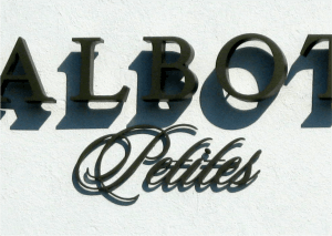
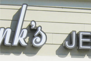
 Like with any sign, establishing the best contrast between the sign graphics and the background is the key to readability. During the morning hours on clear days, just as customers are beginning to make their way to various retailers, the sun is casting long and dark shadows on the channel letters of the world. Depending on their design, this can either create negative or positive readability. If the letter faces are white, the shadows usually help the letters pop out from a light or dark colored wall. If, however, the background walls are light color and the letters are dark without an outline, the effect of the shadows can make it nearly impossible to read because the letters and the shadows will all blend together (see example 1). The shadow challenge can be overcome by incorporating light color faces with outlines and dark returns (see example 2).
Another design strategy of a good channel letter design is to keep the widths of letter strokes wider than the shadow it will cast so it will help with legibility in bright light and shadows. From an engineering view, wide strokes are usually necessary to economically build channel letters and install lighting evenly within them. Also, the width of the lettering affects the viewing angle at which the lettering can be read. The wider the stroke of a letter, the wider the horizontal viewing angle. Viewing angle is important for the visibility of your sign by potential customers passing at close proximity of your storefront.
OUR SERVICE AREA
NEED A SERVICE CALL FOR EXISTING CHANNEL LETTERS? (CLICK HERE)
- If You Liked This, You May Also Like:
Roanoke Airport’s new Wayfinding System
Re-Branding a Retirement Community


