
Effective Elements of Contrast in Sign Design, Part 1: Color

SIGN DESIGN AND EFFECTIVE CONTRAST
Part 1- Color Contrast
From a recent survey of our newslette r subscribers, here are the top 3 reasons sign buyers within a 150-mile radius of Richmond, VA purchase electric signs:
-Attraction of customers
-Stand Out Over Local Competitors
-Customer Interaction with Brand
Since the top reasons customers invest in signage involve maximizing visibility, how should the sign designer address effective color combinations?
Do’s & Don’ts of Color Contrast
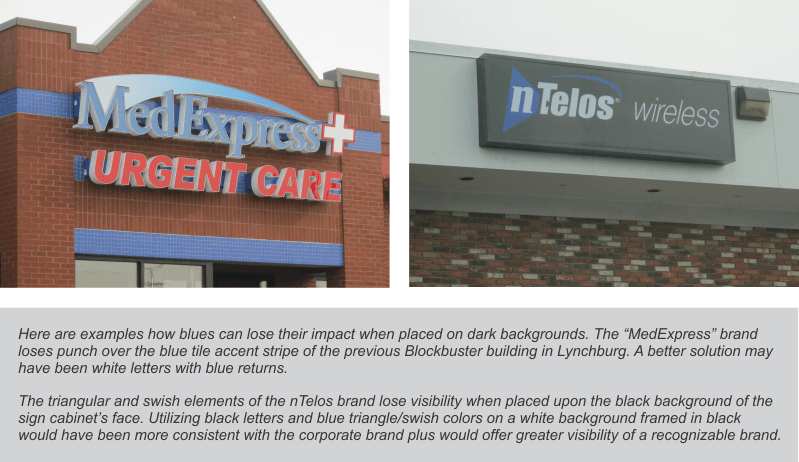
Do choose lighter tone backgrounds for darker tone logos and vice versa. Don’t choose background/graphics colors that lie next to each other on the color wheel unless they are outlined or backed up with a better contrasting “cloud” color. This should be clear in the examples:

 Since many signs are individually mounted channel letters and logos on buildings or monument walls made of brick, stone, or tinted stucco materials, you need to pay close attention to color combinations to achieve the best result; (if you’re branding a regional chain of stores, the same sign design will not necessarily fit every building application.) Other things to consider in initial design are:
- Degree of cast shadows that can either help or hurt the color combination;
- Potential of using outline colors or “clouds” around the letters to improve contrast;
- Night-time conditions and lighting where background and/or graphics colors change;
- Adjusting shades and tones of the colors to make them work.
In summary, choosing the right color combinations for your signage is one important element of effective branding leading to customer attraction and retention. Holiday Signs can help!
See All of our Blog Posts Here
![]()

