 Concerns with Electric Signs Installed on Walls
VISIBILITY CHECK-UP
Of any possible problems with building mounted letters and signs, I think readability should be the first concern. When you pass a retail store or medical office and have to squint or slow down to read the sign — or worse, you can’t read it at all from the road — that indicates there’s a visibility problem.
Other than adequate sizing based on viewing distance, there are 4 big concerns affecting building mounted letters and visibility:
- Cast Shadows
- Viewing Angle
- Color Contrast
- Text Design
CAST SHADOWS
Many times a client will say, “I don’t like my current sign, but I can’t tell you why.” But our skilled sign designers immediately see the problem. Such is the case when channel letters are not designed with cast shadows in mind.
“Channel letters” is the term for three-dimensional fabricated letters and logos that light up internally. They are mounted directly to the wall surface, or sometimes on a raceway that is mounted to the wall. The “faces” of the letters are the flat part of the fronts that light up at night, and the “returns” are the edges that go back to the raceway or wall. Channel letters are commonly used for retail store identification at strip centers, malls and stand-alone stores. They are excellent ways to brand a building, whether a specialty retail store, bank, hotel, restaurant or grocery store. They are also used by hospitals to identify emergency rooms, and by colleges to identify buildings on campus. When designed right, the three dimensional quality of channel letters makes them eye-catching and appealing to both pedestrian and vehicular traffic. Channel letters aren’t limited to storefront walls and can be added to free-standing monument and pylon signs.

As with any sign, establishing the best contrast between the sign graphics and the background is the key to readability. During the morning hours on clear days, just as customers are beginning to make their way to various retailers, the sun is casting long and dark shadows on the channel letters of the world. Depending on their design, this can either create negative or positive readability. If the letter faces are white, the shadows usually help the letters pop out from a light or dark colored wall. If, however, the background walls are light color and the letters are dark without an outline, the effect of the shadows can make it nearly impossible to read because the letters and the shadows will all blend together (see example 1). The shadow challenge can be overcome by incorporating light color faces with outlines and dark returns.

Another design strategy of a good channel letter design is to keep the widths of letter strokes wider than the shadow it will cast to help with legibility in bright light and shadows (see example 2). From an engineering standpoint, wide strokes are usually necessary to economically build channel letters and install lighting evenly within them. Also, the width of the lettering affects the viewing angle at which the lettering can be read. The wider the stroke of a letter, the wider the horizontal viewing angle. Viewing angle is important for the visibility of your sign by potential customers passing at close proximity of your storefront.
VIEWING ANGLE
“Wide letter strokes” and “getting to the point” are part of the formula for good, readable building letters, but proper viewing angle allows a customer to understand your brand as he turns in off the street and heads your way. Unfortunately, many times a store sign becomes unreadable at wide angles, and if a store is located within a row of stores on the far edge of an internal parking lot off the main road, then considering proper viewing angles early on is critical.
The term “viewing angle” in sign design these days has different meanings depending on the sign media you’re talking about. When talking about channel letters, we can define viewing angle as the area where people can effectively read a set of letters. Illuminated letters may have a different viewing angle in the day from the viewing angle at night, and it is always a good idea to take a look at other signs in your commercial neighborhood prior to ordering one for your organization to see what works best and what doesn’t.
Vertical viewing angle measures readability of signs high off the ground. This is a necessary consideration for letters on high-rise buildings, but most retailers with one story buildings need to focus on horizontal visibility. Horizontal viewing angle is the area of view in which a sign can be easily read from points left to right of the sign. Horizontal viewing angle gets wider the farther you move away from the sign, therefore vehicular traffic passing on a main roadway parallel to the sign will have a greater viewing distance than pedestrians or vehicles in the parking area passing right by the front of the store. This is important to remember because while your sign may be legible from the road to lure traffic in, when they get to the row of stores where they thought you were, they may have a difficult time picking up your sign because of the narrowed angle of readability.
The two examples below demonstrate designs that have adequate horizontal viewing angles from the main road, but only one  continues to be readable from close quarters. The reason for the difference is design. The one with the widest viewing angle uses a font with a wide stroke and minimum words. The other uses a narrow stroke font and crowds too many words together on one line. As you approach this sign from angles other than straight-on, the letters eventually run together the closer you get to the store, making it illegible.
COLOR CONTRAST
The top 3 reasons people purchase electric signs are to:
- Attract Customers
- Stand Out Over Local Competitors
- Help People Remember Their Brand
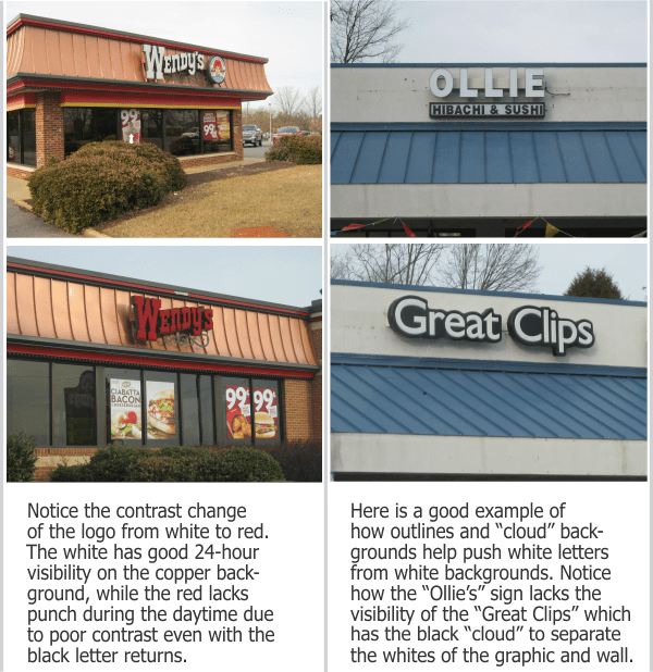
Since many signs are individually mounted channel letters and logos on buildings or monument walls made of brick, stone, or tinted stucco materials, you need to pay close attention to color combinations to achieve the best results. If you’re branding a regional chain of stores, the same sign design will not necessarily fit every building application. Other things to consider in initial design are:
- Degree of cast shadows that can either help or hurt the color combination;
- Potential of using outline colors or “clouds” around the letters to improve contrast;
- Night-time conditions and lighting where background and/or graphics colors change;
- Adjusting shades and tones of the colors to make them work.
Do’s & Don’ts of Color Contrast
- Do choose lighter tone backgrounds for darker tone logos and vice versa.
- Don’t choose background/graphics colors that lie next to each other on the color wheel unless they are outlined or backed up with a better contrasting “cloud” color.
TEXT CONTRAST
Effective sign design utilizes contrasting text colors, sizes, shapes, locations, or relationships for specific reasons.
- Creates Interest vs Monotony
- Captures Attention of Target Market
- Establishes Brand Value Perception (Bargain, Expensive, or Neutral Brand)
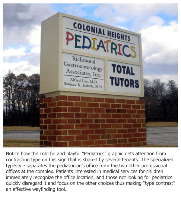
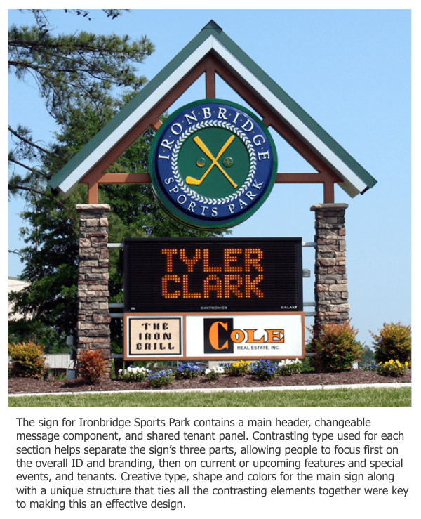
Contrast in type style is achieved by mixing serif and sans-serif letter styles, and by using graphics in creative and unique ways.The designing of exterior branding signage should take into account design factors not considered in print design:
- Day/night viewing
- Architectural wall materials (brick, stucco, glass, etc.)
- Site background elements (greenery, urban landscape, sky, etc.)
Creating good contrast while staying in line with environmental aesthetics can get tricky. The design team at Holiday Signs regularly helps organizations design attractive signage with text that gets 24-hour attention while staying in synch with all this and more. Below are three examples of how we have successfully used contrast in type:
FURTHER READING:
Technically Challenging Sign Projects:
- MeadWestvaco: Why Use Sign Prototypes?
- Virginia Iconic Signs
- Case Study: Hotel John Marshall
- Historic Restoration Case Study
- Powerful Entrance to a Virginia Mixed Use Development
- Dominion Enterprises: High-Rise Branding
- Connects Federal Credit Union
- Historic Restoration-Altria Theater
- ACAC Fitness Centers
Branding & Wayfinding Signs:
- Village Bank
- Pearson Auto Group
- The Wilton Companies
- American Family Fitness Centers
- Kings Dominion
- What is the Cocooning Effect?
- Shopping Center Repositioning
- Re-Branding a Retirement Community
- Turning Eyeballs into Smiles
- Green Marketing
- Site Lighting and Your Brand
- Flexible LED Case Study
- Custom Awnings
- Richmond Executive Airport
- Branding Grace Church
- Shopping Center Makeovers Boosting Economic Development
- Branding and Anniversary at Kings Dominion
- Uppy’s Convenience Centers
Digital Messaging Signs:
6 BENEFITS OF DIGITAL SIGNS:
- Part 1- They Connect With The Community
- Part 2- They Can Be Paid For By Your Vendors
- Part 3- They Grab Attention of the Masses
- Part 4- They Allow You to Own the Media Channel
- Part 5- They Have a Long Track Record of Getting Attention
- Part 6- Use Them for Promoting Loss Leaders
General Signage:
- 6 Reasons to Retrofit Neon to LED
- Consideration of Sunlight and Shadow in Signage Design
- Consideration of Viewing Angle in Signage Design
- Sign Illumination Choices
- How Can Specialty Sign Lighting Techniques Position Your Brand?
- Effective Contrast-Color
- Effective Contrast-Type
- Reverse Channel Letters- Burger Bach Restaurant
- Sign Maintenance- Paint: How Long Should You Wait?
Mark Hackley
Account Executive
540-416-3154


Leave a Reply
Want to join the discussion?Feel free to contribute!