
Effective Elements of Contrast in Sign Design, Part 2: Text

SIGN DESIGN AND EFFECTIVE CONTRAST
Part 2- Contrast in Text

PART OF THE GRAPHIC DESIGN TOOLBOX
Effective sign design utilizes contrasting text colors, sizes, shapes, locations, or relationships for specific reasons.
- Creates Interest vs Monotony
- Captures Attention of Target Market
- Establishes Brand Value Perception (Low or High)
 Contrast in type style is achieved by mixing serif and sans-serif letter styles, and by using graphics in creative and unique ways.
The designing of exterior branding signage must take into account design factors not considered in print design:
- Day/night viewing
- Architectural wall materials (brick, stucco, glass, etc.)
- Site background elements (greenery, urban landscape, sky, etc.)
Creating good contrast while keeping in line with architectural and environmental aesthetics can get tricky.
The design team at Holiday Signs regularly helps organizations design attractive signage with text that gets 24-hour attention while staying in synch with all this and more.
Below are three examples of how we have successfully used contrast in type.
Successful Type Contrast in Action
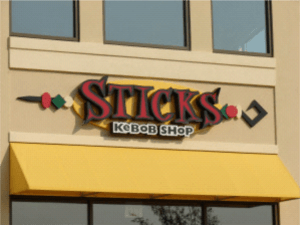
For “Sticks Kebob Shop,” we made typefaces heavier than those used in print. Most of the time graphics should be beefed up when used in signage that is viewed from sizable distances compared with print ads and menus. Notice how the main name is a serif font and the secondary wording is sans-serif creating interesting contrast. Also, notice the contrast in outline colors that helps the “Kebob Shop” words stand out even with the huge difference in letter height between the two lines of text.

The sign for Ironbridge Sports Park contains a main header, changeable message component, and shared tenant panel. Contrasting type used for each section helps separate the sign’s three parts, allowing people to focus first on the overall ID and branding, then on current or upcoming features and special events, and tenants. Creative type, shape and colors for the main sign along with a unique structure that ties all the contrasting elements together were key to making this an effective design.
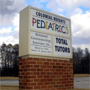
Notice how the colorful and playful “Pediatrics” graphic gets attention from contrasting type on this sign that is shared by several tenants. The specialized typestyle separates the pediatrician’s office from the two other professional offices at the complex. Patients interested in medical services for children immediately recognize the office location, and those not looking for pediatrics quickly disregard it and focus on the other choices thus making “type contrast” an effective wayfinding tool.
6 BENEFITS OF DIGITAL SIGNS:
- Part 1- They Connect With The Community
- Part 2- They Can Be Paid For By Your Vendors
- Part 3- They Grab Attention of the Masses
- Part 4- They Allow You to Own the Media Channel
- Part 5- They Have a Long Track Record of Getting Attention
- Part 6- Use Them for Promoting Loss Leaders
See All of our Blog Posts Here

