How to Restore Old Theater Marquees?

www.holidaysigns.com-richmond-virginia-theater-marquee-historic-restoration

How to Restore Old Theater Marquees?

How Signage Restores the Glamour of Virginia’s Downtowns

October 2013- Technically ChallengingNEON NICHE

  Historic marquee sign restoration at theaters is one of the few remaining applications for neon lighting and signs, which is gradually being replaced by greener LED lighting technology. “This could be the last big neon job we’ll do,” said Bob Morin, owner of Holiday Signs of Chester, Virginia. Bob was referring to his project for the Virginia Repertory Theater, located in downtown Richmond.

  The Virginia Repertory Theater got its start in 1911 as the November Theater and passed through many hands on the way to its current ownership. It was shut down during the decline of American downtowns which left many areas of Richmond abandoned and empty. Several community theaters in town were underfunded and this project was the result of consolidation of a few of them. Holiday Signs worked with Kjellstrom & Lee and Commonwealth Architects on the job. Competitive pricing and experience with historically-true renovations were the main reasons why Holiday Signs was awarded the contract.

RESTORING THE GLITZ

  The biggest challenge of the project involved accurately restoring the theater’s signage to its original glory. The theater was still using the old, dilapidated marquee. It was rusted and falling apart. Part of the requirements of receiving HUD funding for renovations was that restorations had to be historically accurate. The general contractor had stripped the old skin down to the bare structure and getting a good fit for the radius surface of the marquee was difficult. The building’s framing was hand built back in the days when lumber sizes varied from board to board. There were many inconsistencies and over the course of a century, many things were out of line. “It’s hard to build a sign of that size with a radius working in modern conditions, but even harder as a renovation,” explained Wade Gentry, production manager at Holiday Signs.

  Another challenge was related to the urban setting of the theater. Sight lines and viewing considerations for downtown signageOctober 2013- Technically Challenging projects differ from projects in other areas where there is much more room and distance around the sign to the viewer. Because urban signs are in closer quarters, there has to be more attention to detail. The marquee and sign above was only part of the entire project. In addition to the marquee, there was also a large flag-mounted sign, signs for the neighboring theater space and donor recognition signage.

  Lighting involved with the sign renovation was extensive. The curved surface reader-board originally had skeleton neon tubing all around it which was brought back to life in the restoration process. The lighting under the canopy of the marquee had 500′ of light bulbs and the new entrance way to the theater has been described as both “quaint” and “cool” at the same time. Phil Whiteway, the theater’s managing director, loves the sign. “It lights up West Broad Street like a beacon of vitality,” he said. “We’re really happy with the outcome of the whole project! The name change was very important to us and the sign was laudable and a very important element of our re-branding and historic renovation.”


October 2013- Technically Challenging October 2013- Technically Challenging October 2013- Technically Challenging


Case Study: Renaming a Historic Richmond Theater:

From the Mosque to the Landmark to the Altria Theater…


www.holidaysigns.com-altria-theater-historic

NEW THEATER BRAND UNVEILED

  On February 21, 2014, the historic “Landmark Theater” got its new “Altria Theater” name in lights in a theater marquee upgrade. For more than 85 years this iconic performing arts building in Richmond, Virginia has hosted musical performances from Elvis Presley to The Lion King.  

  Utilizing a generous $10 million gift from the Altria Group, the parent company of Philip Morris, Holiday Signs designed, fabricated and installed a new 30 feet wide, 3.5 feet tall and 18 feet deep marquee which includes a full-color digital display and LED chaser bulbs.  Richmond’s mayor, Dwight Jones said this is a historic day for Richmond and lovers of the arts and culture. He said, “This will be an important anchor for the Richmond Arts District.”

www.holidaysigns.com-richmond-who-makes-theater-signs

DIGITAL OR MANUAL DISPLAY?

  “The choices were to go back with the old style manual display or go digital,” said architect, Bruce Herrmann of Wilson Butler Architects of Boston. “We are thrilled to have chosen digital.” he explained.

  The new marquee will now feature the theater’s attractions in a full-color digital display containing 100,000+ vibrant LEDs.www.holidaysigns.com-richmond-va-who-restores-old-theater-marquees?

  Utilizing Altria’s corporate logo as their palette, Holiday Signs was able to custom match to their multi-colored logo and incorporate it into the diamond patterned decorative band wrapping the entire structure.  The canopy was custom fabricated and painted to match the historic ornamentation of the period.

LAST MINUTE DETAILS

  “The most challenging aspect of the project was handling all the details with respect to warming up to what both the donors and the architect wanted,” commented Colin Robinson, Senior Project Manager with Gilbane Building Company, the project’s General Contractor.

  “This was a design-assist project with things completely changing up to a week before final sign fabrication. Holiday Signs did an excellent job in rolling with the punches and provided everything as needed,” Robinson said.

wmond-va-unveiling-theater-marquee-altria

DELIVERED ON SCHEDULE

  “The sign is beautiful,” extolled Charlie Agee, Director of Corporate Contributions and Community Relations for Altria. “It’s even better than we could have imagined. There were major winter storms dogging our schedule, but Holiday Signs was able to get the job completed in time for our grand unveiling ceremony,” he commended.

www.holidaysigns.com-richmond-vaEXPERIENCE

  Custom sign fabrication takes a great deal of expertise, especially when tasked with fabricating and installing signage that must accurately represent a particular period. Performing arts venues are now embracing the need for timely message updates.  Electronic Message Centers provide venues with the ability to easily update their coming attractions. As experts in this field, Holiday Signs understands the needs of our clients as we are able to balance stakeholder concepts with architectural aesthetics, historic accuracy and district code limitations.


Contact: Holiday Signs Design & Sales Team

(800) 229-9443   www.holidaysigns.com


www.holidaysigns.com-richmond-virginia-historic-renovation-preservation-signage-signs


 If you liked this, you may also like:


printer friendly icon


How to Rebrand a Shopping Center?

www.holidaysigns.com-richmond-va-sign-renovation-pricing How to Rebrand a Shopping Center?

October 2013 Digital Messaging-Shopping Center EMC's JD final photosGLAMOUR LOST?

  If your shopping center’s signs have been around more than ten years, this article may help you ponder a sign renovation project. Replacing or upgrading signage at shopping centers is a good way to turn humdrum entrances and storefronts into dazzling attractions. Styles change and weather just does what it does to deteriorate their former glow over time. Even if your current sign system hasn’t been around too long, it always makes sense to renovate if the change will have a profound influence on attracting more business.

WHAT’S IN A TYPICAL RETAIL CENTER SIGN PACKAGE?

  The typical shopping center signage package consists of:

  • Free-standing project ID signage: The free-standing signs at the center entrance(s) is/are usually the large pylon or monument type. To renovate a pylon, the outer shell is stripped off to the steel and concrete structure and, if in good shape, a new sign is slipped over the old bones. The average cost to renovate a free-standing sign within our service area varies but examples below can give you a better feel for the average cost ranges of typical projects. Adding a digital component increases the investment and potential for better communications and more business for tenants. Renovating monuments usually costs less than pylons. 
sign renovation examples rockwood before after pylon
A total investment of about $73,000 renovated two entrance pylons and a row of tenant wall signs at Rockwood Square, providing a modernized look that gets the attention of both customers and prospective tenants. Prior to the makeover, the center had a high vacancy rate, but after all the renovations it is now 98% full, much of which is attributed to new signs!


June 2014- Branding- Shopping Center Repositioning brook hill
These dated Brookhill Azalea center entrances were transformed into fresh, new multi-tenant identification signs that compliment each other and inspire customers to shop. The new signs allow tenants to broadcast 24-hr customized digital messages to potential shoppers passing by for an investment of about $55,000 a sign.


  • Pad site signage: Many shopping center properties with pad sites can have both free-standing signs and building-mounted signs at tenant pad site locations. Renovating signage at these sites ranges depending on what’s involved. Custom awnings, multiple sets of building-mounted channel letters, over-sized pylons, digital messaging, and parking lot directionals all add cost. 
www.holidaysigns.com-fishersville-va-cost-of-sign-renovation-electric-signs
Augusta Health, of rapidly expanding Fishersville, Virginia, occupies a former Blockbuster Video building that they had us transform into a new outpatient clinic in Staunton, Va. We replaced the channel lettering and stripped the old blue awning fabric and replaced it with new maroon awnings with back-lit graphics advertising the clinic’s range of services. The total cost was less than $25,000 and work was fast-tracked to successfully meet their grand opening deadline.


  • Individual tenant store signs: Most retail center tenants use wall-mounted signs at their storefronts. The most popular tenant storefront sign type is channel letters. Store branding can also be conveyed using box signs, and then there are many other creative options including flush or three dimensional spot-lit signage, graphics painted directly on the wall, and custom awnings.
www.holidaysigns.com-richmond-chester-chesterfield-va-custom-electric-signs-LED-channel-letters
Channel letter signs are the most frequently used signage by shopping center tenants. There are many lighting options for various effects and letters can be individually mounted or attached to raceways that are usually painted to match the wall color. Channel letters are a very economical way to promote a store’s brand and merchandise. Contact us for quotes.


sign renovation examples-rockwood tenant signs
One way to improve an overall look is to keep tenant signs consistent and uniform regarding colors and layout. The new sign backgrounds are opaque, so at night all that is seen is the copy and the lighted sconces giving the retail center a classy look compared to the old hodge-podge image portrayed by standard illuminated white-background box signs.


WHAT DRIVES COST?

  Here is a summary of the primary factors that drive the cost of shopping center sign renovations:

FREE-STANDING PROJECT ID/ PAD SITE SIGNAGE

  • Quantity of signs
  • Size/Design/Height
  • Use of digital sign equipment
  • Condition of structure and foundation
  • Custom embellishments to be used

TENANT SIGNS

  • Quantity of signs
  • Size/Design/Height
  • Box Sign versus Channel Letter construction
  • Form of Lighting: Internally-Lit, Face-Lit, Halo-Lit, Non-Lit
  • Embellishments


Two Real-Life Retail Center Renovation Success Stories…


WAYS TO TRIM COSTS FOR TENANTS (ROCKWOOD SQUARE PROJECT)

  Prior to its makeover, Rockwood Square Shopping Center had a high vacancy rate, but after all the renovations it is now 98% full, much of which is attributed to the new signs according to Gary Modjeska of AREA Properties. “Signs were a very, very important part of the repositioning of the property,” he said.

  Since the property was not a high end center, the client wanted signage that would not be too expensive for potential tenants. Gary worked with Holiday Signs to come up with a new design for the center’s signs. Before renovations, the center had plain, rectangular-shaped box signs with flat faces and poor hodge-podge designs. The client originally planned to replace everything with channel letters but asked us what we thought. We suggested nice design for box signs that would include some architectural amenities, and if there was a tenant change all that would need to be done is swap out a new face, keeping a new tenant’s costs down in the future versus them having to come up with money for a new set of channel letters.

  The Holiday Signs design team utilized an interesting lighting sconce detail for the box signs and the main pylons that tied all thesconce detail signage together. The detail also appears on the under-canopy signs as well. The owner liked the idea of keeping all the tenant signs consistent and uniform regarding colors and layout. Sign backgrounds are opaque, so at night all that is seen is the copy and the lighted sconces giving the retail center a classy look versus what they had before with standard illuminated white-background box signs. Adding simple architectural details and keeping all signs consistent in design supports a unified theme that is attractive to customers and has helped the center grow and thrive again after the re-imaging.

  By utilizing box cabinet signs for the center’s tenants versus channel letters, it makes them all consistent, easier to change, and less expensive than custom channel letters. If not a high end property, lower upfront costs attract and keep more long-term tenants, and there are many creative options to keep costs down while promoting a consistent and eye-catching sign design.

RAISING THE VOLUME OF BUSINESS (TOWNE CENTER WEST PROJECT)

  Holiday Signs added two large full-color Electronic Message Centers (EMC’s) to an existing double-faced entrance pylon at Towne Center West of Richmond. It’s located next to a 1.3 million square foot Super Regional Center, so competition for shoppers is intense.

IMG_0357  Prior to adding the EMC’s, most of the inline tenants had limited visibility to the 25,000+ cars that pass by the center each day. They spent countless advertising dollars to draw customers into their shops, but only produced limited results. Anxious to increase their tenants’ visibility and draw in new customers, the developer hired Holiday Signs to help.

  Holiday Signs specializes in helping developers and shopping center management revitalize the signage for their centers. Many times we recommend updating signage with new designs, graphics, tenant panels or fresh paint but in this case the main identification sign was only a few years old. A thorough analysis suggested the addition of two new EMC’s to the existing pylon would give the tenants their much needed visibility.

  Once the EMCs were in place and the messages started rolling, tenants began to see an immediate increase in traffic to their stores.

 IMG_0279IMG_0280


Interested in cost ranges for various sign projects? Then, read these:

How Much Does a Digital Sign Cost?

What’s the Maintenance Cost of Digital Signs?

What’s the Operating Cost of Digital Signs?

What’s the Cost to Add Message Boards to Signs?

What’s the Cost to Upgrade Message Boards?

What’s the Average Sign Project Lead Time?

What’s the Typical Cost of Sign Renovation?


https://holidaysigns.com/category/hs/newsletter-blog

NEED MORE HELP?

DOWNLOAD INTERESTING SIGN CASE STUDIES HERE


Printer-Friendly-icon2

How to Buy an Electric Sign?

www.holidaysigns.com-virginia's-sign-company

How to Buy an Electric Sign?

Part 1: Deciding What’s Right when Choosing Signage

A PROCESS

  On any given day, our project managers are working on a variety of sign types.  I walked through our Chester shop and among the many projects in production, I noticed a set of custom channel letters for a church, an internally illuminated pylon sign for a shopping center, a wall cabinet sign for a hair salon, and a fairly large electronic message center for a hospital all being assembled.

  The processes by which these various sign types were specified for particular projects is complex, and in my mind, not part of the typical selling approach of the average sign shop in Virginia.

www.holiday-signs-richmond-va-electronic-message-signs-image

  There are 4 basic questions we ask customers in the preliminary design stage of a sign. Leaving any unanswered can lead to ineffective sign solutions:

  • What is your desired image?
  • What is your “budget”?
  • What fits best with the building, the neighborhood, and the local code?
  • How do you determine placement and size considering viewing distance & sight lines? 

LOOKS ARE EVERYTHING

  The response to the first question concerning overall image has to be extremely unique. After all, shouldn’t your site stand out over everyone else on the block?  Keeping in mind that you only get one chance to make a first impression, it’s important to spend extra time pondering an effective sign design.September 2014- General Signage- Our Approach to Selling Signs, Part 1 blog blurb

  Quite often in small organizations, the owner, general manager, pastor, or whoever is in charge of the site being branded, is the brand and the signage could be designed to reflect his tastes and personality. In larger, more structured organizations, the brand may be more thought out.  For example if an organization’s branding statement is, “We are part of our community,” then perhaps a sign matching the style of the community that integrates a digital component able to post community events under a fresh and inviting sign with the company’s logo would be the best answer to: “What is your desired image?” 

  Sometimes it’s initially difficult for our clients to perceive the sign type that’s best for them. When contemplating new digital signs, we frequently ask customers to list a few nearby signs they like and a few they dislike, and reasons why. Exercises like this help our project managers brainstorm sign designs that will fit their client’s tastes.

Part 2: The Budgeting Process

RESEARCH NEEDED
  Dave Elmore, the owner of Bookkeeping and Management Systems in central Virginia, says he has over 300 business clients and not a single client has a line item for signage. We often put quotation marks around “budget” when discussing the word since, more times than not, our customers have only vague ideas of what an effective custom electric sign costs. And especially one equipped with a high-tech electronic message center! The most important question sign buyers need to answer before they come up with a budget is: “What is needed to get the job done?” From this starting point one can determine the specifications for the most effective budgeting for digital signs.

www.holidaysigns.com-richmond-va-Watchfire-Daktronics-LED-EMC-digital-signage-signs 

   Once the customer has an idea of what would get the job done, cost can be determined. Then you can budget for it, and if appropriate, let any groups or departments who have to help pay for it know how much and why.

   Also, since most applications of digital signs produce revenue, you should consider the positive impact on operating budgets. Daniel Dern representing TechDecisions, addressing the business needs of management in corporate, education and worship markets, was correct when he said, “Depending on the nature of the project, the deployment of new digital signage may end up replacing, reducing, or avoiding other expenses, perhaps even costing less than previous activities, or even be a revenue generator. Or the signage may have less tangible but still valuable benefits in ways that can’t be measured in ROI.”

www.holidaysigns.com-richmond-watchfire-daktronics-digital-sign-solutions-budgeting

CREATIVE ACCOUNTING
  We have seen companies divide sign purchases across multiple budgets. A hospital client for instance considered splitting the cost of a new digital message sign between its facilities and marketing budgets to make it work. Many retail customers who advertise across multiple media channels sometimes place digital sign purchases in their operating versus capital budgets, making a purchase possible by reallocating funds from other lackluster advertising categories for better results. A good example is how clients have reallocated Yellow Pages and other non-productive advertising dollars into new digital signage for much greater ROI.

SOLUTION DRIVEN
    If an actual budget number is discussed as a max spend, our project managers usually tailor the best solution based on someone’s budget restrictions, but that doesn’t always mean it’s the best solution for the site. Don’t just look at equipment cost alone when shopping for digital signage. It’s more about what type of equipment and supporting signage and structural design fit best, based on image, visibility, usage, and many other factors. We think the best approach to purchasing a sign is making a comprehensive assessment of all the factors, designing the signage based on that assessment, and coming up with price parameters to provide the best solution possible.

Part 3: Environment

October 2014- Branding- Our Approach to Selling Signs Part 3 photo group 1

GETTING NOTICED IN A POSITIVE WAY
  Environmental graphic design is a unique field within our industry – sign designers, landscapers, engineers, architects, welders, painters, masons, carpenters, installers – that collaborate to create amazing sign projects that work in generating business while blending in with the environment. Well-designed signs have the power to move people to appreciate a business and even change a person’s behavior. A person previously prone to passing a certain business is suddenly inspired to turn in!

  So how do you stand out and blend in at the same time? Decisions, decisions…

  It’s not too hard to stand out. I’ve met a few marketing consultants who are occasional fish-tie wearers when they need a gimmick to be remembered.  And we too have actually built a huge bass fish sign for a commercial client wanting to make a statement at the entrance to their development, so I’m not knocking the big fish idea. It’s just that generally speaking, most people aren’t so flashy and usually for good reason. The hard part is coming up with good sign solutions that blend corporate statements into surrounding environments.

October 2014- Branding- Our Approach to Selling Signs Part 3 group 2

MORE THAN JUST HANGING A SHINGLE
  A business site has to secure a strong, competitive position in order to prevail. Your building location, and how you promote it, is crucial to the ultimate success of your business. Signs make lasting impressions that work; whether they are positive or negative is up to you.

  You just can’t just throw any old sign system together and expect results. A sign purchase is important and should be well-planned. I recommend working with a reputable, established sign company whose project managers understand your unique site branding and advertising goals and the many variables working against you in reaching them.

October 2014- Branding- Our Approach to Selling Signs Part 3 group 3

ENVIRONMENTAL CONSIDERATIONS
  Here are some basic questions your sign consultant needs to ask specifically about your site:

  • What fits best with the building or neighborhood?

    Are elements of the building’s architecture reflected in signage design and embellishments?
        -Colors: Historic, Colonial, Architectural, Natural?
        -Building Materials: Brick, Stone, Concrete, Stucco, Painted Metal?
        -Pitch of roof: Flat, Peaked, Slanted, Domed?
        -Special Features: Columns, Quoins, Cornices, Window Design Elements

  • What fits best in both daytime and nighttime viewing? 

    What type of lighting will work best for consistent 24-hour branding?
        -Spot Lighting?
        -Day/Night Films?
        -Dimensional Letters and Shadowing Factors?
        -Reflective Films?
        -Back-Lighting Options?
        -Digital Signage Options?

  • What works throughout all seasons?
  • What does code recommend and allow?

Part 4: Sign Viewing Distance & Sight Lines

DOWN TO A SCIENCE

  There are reasons for selecting certain sign products, and the best solutions can only be accurately estimated once you determine what’s best for your particular site.  Our approach to selling signs is a process. Throughout what usually ends up being a series of meetings, our project managers educate customers about effective sign design, asking important questions to “scientifically” develop each sign proposal.

  Two important sign design considerations in choosing the right sign for your site are:

  • What’s the best height relative to the roadway elevation and obstructions?
  • What’s the optimum sign viewing distance from the road?

who-makes-retail-electric-signs-in-virginia-va?

STEPS TO MAXIMIZE VISIBILITY:
1. Determine Obstructions

  First, you need to determine any viewing obstructions that could prompt raising the overall height of your sign. Crowded visual environments detract passers by from reading low-to-the-ground signs, so elevating signs can enhance their visibility in certain areas. Sometimes, simply because of a low grade, you have to elevate a sign just to get it in the pNovember 2014-Technically Challenging- Part 4 Our Approach to Sales Blog Blurbroper sign viewing zone for motorists. In cases where signage fronts interstates or other high speed thoroughfares, the higher the sign the better for maximum exposure.

2. Chart your Visibility Zone

  Once you determine the right height, you need to map out your “sign visibility zone.” The optimum visibility zone is in the area where the line of sight drawn at 45 degrees from the sign in each viewing direction intersects the center of the roadway extending back to a place on the highway within the driver’s cone of vision without visual obstruction to a point where the sign can be designed to maximize the local code. 

3. Design Your Sign

  After you have figured out the maximum line of sight, you need to plan the minimum letter height for readability from that distance. (As a general rule of thumb, calculate about 1 inch of letter height for every 36 feet of sight distance based on average letter contrast and 20/20 vision on a clear day.) Keep in mind that LED-lit signs actually have a greater visibility distance at night and LED message signs have better readability 24 hours a day because of the sign brightness. In addition to sign height and letter height, other factors like viewer reaction time, viewer reaction distance, color contrast, and negative space also play a part in the overall scientific sign design for optimum visibility.  Now you can design an effective sign sized correctly, designed for best contrast and readability, maximizing code to do the best job of turning traffic into customers.

Part 5: Sign Prototypes & Demonstrations

www.holidaysigns.com-difficult-sign-projects-richmond-virginia-custom-electric-signs-consultantsPART OF A PROCESS

  The following examples are how we have used sign prototypes and demonstrations and involve some of the most technically challenging situations and why they were a necessity. But even when selling the more typical sign projects like electronic message centers for a church, or a set of channel letters on the front wall of a local retailer, there are benefits of smaller scale demos and mock-ups.

  Here are three reasons for considering sign prototypes and demonstrations:

  • ENSURING VISIBILITY
  • HISTORIC ACCURACY
  • COST CONTAINMENT

ENSURING VISIBILITY

  The location and entrance of a client’s medical complex was hidden from the main highway. They needed help with signage that directed people to their site for services. Because of the elevation of the property and high speed of passing traffic, a sign raised substantially off the ground was their best bet.

  Utilizing a weather balloon, we aided our designers and client in gaining a clear picture of just how the sign would appear from the roadway. Our customized demonstration indicated the best heights and bearing points necessary to reach the most traffic.
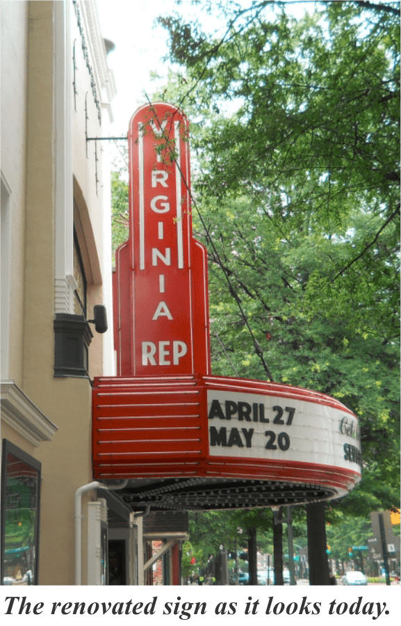
HISTORIC ACCURACY

  When owners of an historic Virginia hotel began redevelopment, they needed to make substantial energy improvements to obtain HUD funding.  We had to make sure the proposed new energy-efficient signage was historically accurate.

  The old landmark sign was rusting away. The lighting once used to illuminate its gigantic letters was the old incandescent type. There were some 1,400 light bulbs per side that regularly burned out and there was always a big safety concern involved with changing them.

  Our creative solution replaced old incandescent bulbs with low-voltage LED lighting that looked historically correct by using modern digital printing technology. We demonstrated prototypes prior to final manufacture. Collaborating with the owners, architect and general contractor we tweaked the digitally printed bulb designs and LED lighting placement to where all parties were satisfied with the effect.

COST CONTAINMENT

  Cost containment is a big benefit of using prototypes for signs, especially for high-rise applications. From our experience, we know it’s best to get it right on the ground before committing to build the whole thing.

  We provided a Gen 1 Prototype based on the original design specifications. After critically viewing the first version of the illuminated corporate logo from the ground, a team of senior executives immediately wanted it taken down and redesigned. Both the lighting and framework were redesigned and a Gen 2 Prototype was prepared. Before this could be approved for production, a final Gen 3 Prototype was ordered because the client re-designed their logo.

  Even with the extra cost in the early design stages, utilizing prototypes trimmed more than 50% off material, labor and fuel costs that would have been incurred had the three design changes been worked out later in a high-rise environment.

December 2014-Technically Challenging- Part 5 Our Approach to Sales-Generic Sales Copy 2 blog blurb


If you liked this case study, here are some more:

Turning Eyeballs into Smiles in Virginia Beach

Turning LED Lights into Coats for Kids

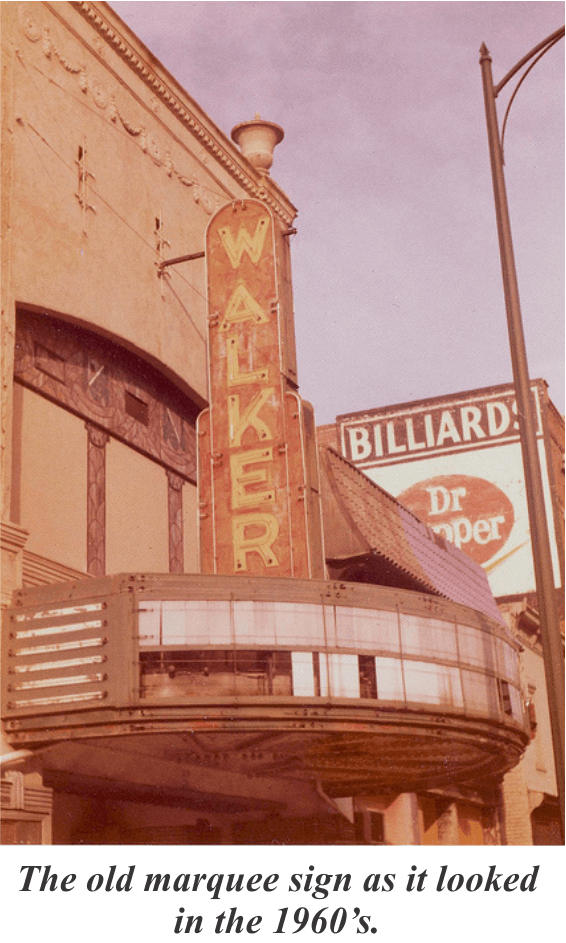
Restoration of a Historic Virginia Theater Marquee

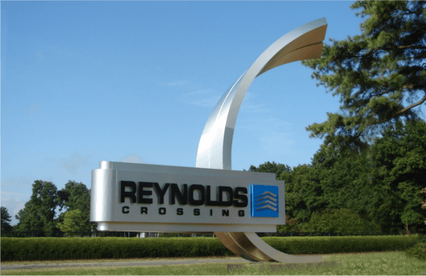
Creating Maximum Exposure-Part 1

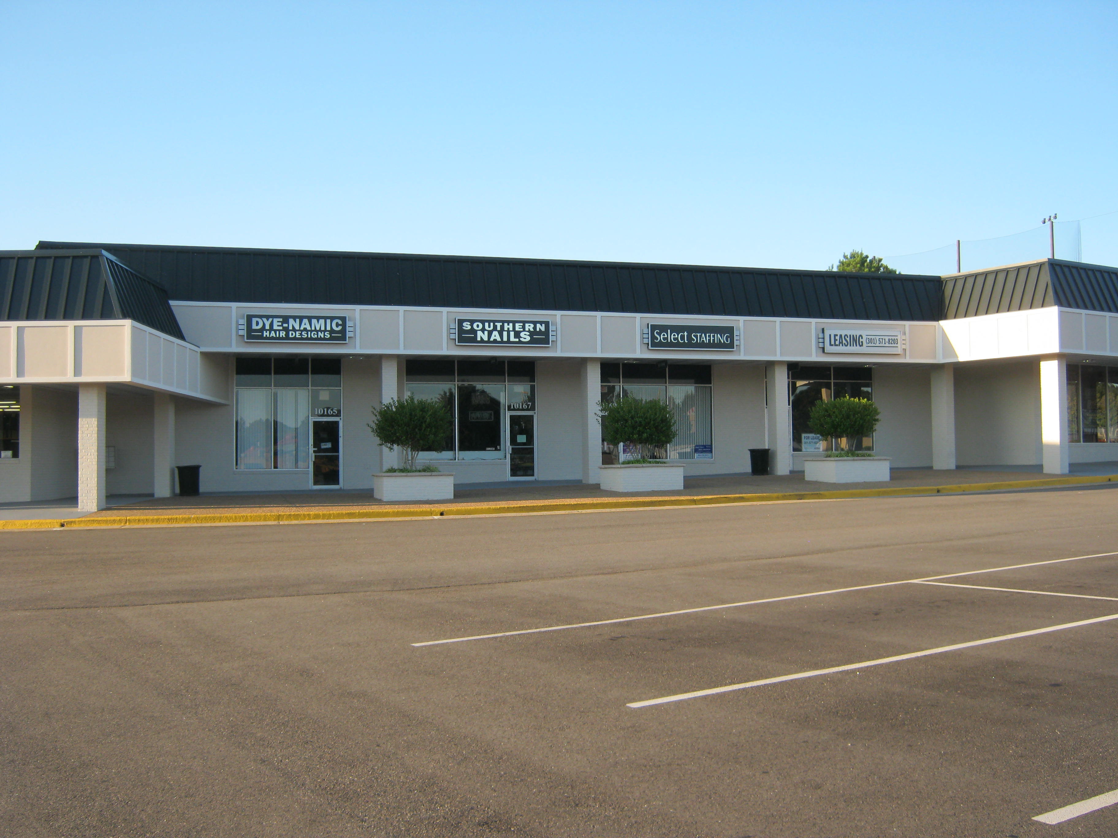
Increasing Shopping Center Tenant Visibility


How to Get an Electric Sign Permit?

November 2013-General Signage-Permitting-Pioneer BankHow to Get an Electric Sign Permit?

  If you are going to install a new sign, you will generally need a sign permit. Licensed electric sign companies who build and install electric signs generally handle the permitting as part of the project. Since the average fee to secure a sign permit is around $400-500, you can save money by getting the permit yourself.

  It’s important to think from a permitting point of view from the start of any new sign project. Zoning codes and local ordinances need to be understood before a sign design is started. If not, you could end up spending extra for design changes. Most localities have sign quantity and area allowances based on street or building frontage. The language in most sign codes is so much area for so much frontage, or so many signs per each road frontage, etc.

  There are some types of signs and sign maintenance activities in which permits are sometimes not needed. These things include sign face changes, routine lighting maintenance, repainting the sign structure, temporary signs and banners, historical markers, and interior signs to name a few.

GETTING THE MOST SIGN AREA YOU CAN

   In 2012 Holiday Signs created customized branding for a new branch of Pioneer Bank in Charlottesville, Virginia. The Stanley-based company expanded into Ruckersville and called on us again for signage. The bank’s new site had outstanding visibility since it was positioned at the entrance to a new Wal-Mart Super-Center in a fast growing area of Greene County; so how to get sign permits that were generous to business marketers out of the County’s zoning ordinance for sign allowances was an important matter.

PROVIDING BRAND PUNCHNovember 2013-General Signage-Permitting-Pioneer Bank

  PW Campbell was the General Contractor for the construction of the new branch. Our contract for the signs was with Pioneer, but all coordination was through PW Campbell. The bank and the general contractor contacted us saying they had talked with the county and were only allowed one building mounted sign. Understanding the significant value of bright and eye-catching signage for customers with highly visible locations, Holiday Signs always digs deep into finding ways to get the most “punch” for our clients. By right, customers are often allowed more signage than they realize. In some instances, where restrictive codes limit customers’ visibility, we can serve as their consultant requesting special code variances on their behalf. Sometimes we are also able to suggest simple sign design ideas that can help raise attention when signs are limited in size and quantity by local codes.

THREE TIMES THE IMPACT

  After further research into the Greene County Zoning Ordinance, we were able to get Pioneer Bank three times as much sign area above what they had originally perceived they were allowed. This was a huge achievement because instead of only being able to utilize one small building-mounted logo on one side of the Backup_of_Blog Blurbs 11-13heavily traveled corner, they could now promote three new logos offering 24-hour identity and branding. One logo could face the sizable volume of traffic turning off Route 29, and the other two could face the critical Wal-Mart entrance road. 

  Pioneer’s Ruckersville Branch opened with prominent signs on three sides of the building, achieving maximum exposure for the bank’s new location.

ALLOWING ENOUGH TIME

  Depending on the locality, permits can take time, and it needs to be factored into sign lead-time estimates. We generally allow for 1-2 weeks for localities to approve permits, varying slightly by locality. Usually the more dense the population the longer the permitting will take. So obtaining sign permits in Northern Virginia (Fairfax, Arlington, Prince William, Stafford, etc) generally takes longer than say Chesterfield, Hopewell, Colonial Heights, etc.

www.holidaysigns.com-richmond-virginia-pylon-signs

BEFORE


SIGNAGE BEFORE & AFTER- See how enhancing a sign’s structure can gain more attention and stay within code:

PROMINENT, EYE-CATCHING SIGNS ESSENTIAL

  Code allowances related to sign area usually involve the calculations of the area of the sign graphics as opposed to the sign’s structural elements. Therefore it’s possible to add mass to new or existing signs and still stay within the local building codes.

  Such was the case with the new signage we designed, fabricated and installed for Floor & Decor in Richmond, in partnership with the developer, S.L.Nusbaum Realty Company. The retail chain’s new Richmond location that occupied a former K-Mart across from the Reynolds Development used to be the big retail hotspot in the area but had been vacant for at least three years prior to Floor & Decor’s move into the building this year.

  Prominent, eye-catching signage was essential because of their prime location at the busy corner of W. Broad Street and Glenside Drive, and also because Wal-Mart’s new Reynolds Crossing store nearby would soon be drawing even more traffic in front of their store. Plus, Floor & Decor was a new player in the Richmond area, so they needed effective branding of the building and site to help get their name out quickly to potential customers.

ADDING MASS WHILE STAYING IN CODE

www.holidaysigns.com-pole-signs-virginia

AFTER

The old K-Mart pylon sign was a single pole type with a sign on top. Holiday Signs removed the old sign and replaced it with a two-pole pylon with decorative pole covers on a large base to offer more visual mass. Also, due to the growing traffic count at the corner, the new pole structure was engineered for adding an electronic message center at a later date, with steel framework in place to accommodate a new digital sign once the other half of the building is leased.
 
There was also a smaller sign located at another entrance that needed visual enhancement. We raised the small sign by constructing a large masonry base to make it more visible to traffic passing by on Broad Street. “It was an exciting project,” said Carter Thompson, Holiday Signs’ project manager who handled all the signage details. “They all love the signs,” Carter said.


If you liked this case study, here are some more:


***CONTACT US!***


How to Make an Eye Catching Entrance Sign

Eye Catching Entrance Signs headerHow to Make an Eye Catching Entrance Sign

HARPERS MILL- TRANSFORMING DIRT INTO AN ICON
   Harpers Mill Subdivision wanted a bold entrance. As with any new construction project, the first hurdle is being able to envision the end result as you stare at a pile of ungraded earth. An important element of iconic entrance sign projects is being able to effectively coordinate things between the developer, the architect, the county, the utility companies and various trades and professions.

   Holiday Signs consulted with a surveyor to get the foundation placed exactly right and, working from his reference points, the huge limestone structure was placed just where it needed to be.

Eye Catching Entrance Signs pic 1
   “Figuring out where to put the foundation in the midst of a big dirt pile and power line takes planning,” said Henry Moore, Project Manager at Holiday Signs.
   The finished signage boasts a waterfall and fountain. Many of the limestone blocks weighed 400 pounds and the end column with the community’s brand was 20′ high.  
   “The biggest challenge on larger projects like this is getting the concrete foundation right the first time to make sure all the subsequent pieces will fit together. The end product has to convey what the original design concept was all about. As project manager, you have to be able to look at all the parts and pieces in advance to make sure they will all go together as planned. If you miss one part, you have to do a lot of manipulation to make it all come together,” Henry said.

REYNOLDS CROSSING- THINKING BIG
   Collaborating with the developers of Reynolds Crossing, a retail and medical office park off I-64, we created a unique entrance sign. The finished sign, taking the form of a large modern sculpture, conveys the corporate brand and took the ideas and workmanship of a talented staff to complete. A small-scale prototype was produced prior to manufacture so both customer and craftsmen understood the ultimate outcome. Being able to manufacture the complex compound curves of the sign’s design elements without a flaw was truly an art that few area sign companies can achieve.

Eye Catching Entrance Signs pic 2

The iconic Reynolds Crossing sign in Richmond:

  •     Impacts passengers of 36,000 vehicles daily
  •     Impresses millions over its lifetime due to its enduring and eye-catching design

   Signs as part of a company’s regional branding efforts can become icons very quickly. With over 8 million sets of eyeballs right here in Virginia it pays to think big! And iconic branding makes a difference. Scientific studies show that the few select brands considered iconic enjoy a 58% top-of-mind awareness for customers versus a 36% awareness for those considered just strong brands.

  •     Iconic Brands become “super-familiar” versus just “familiar”
  •     “Super-familiar” brands are more likely to be considered for purchase over competing “familiar” brands

CAPITAL ALE HOUSE- BRIGHT IDEA
   When Capital Ale House opened its new Harrisonburg, Virginia location, they chose Holiday Signs to renovate the signage. In addition to new awnings, wall signs and parking lot signs, the existing oval shaped electric sign was refaced and retrofitted with flexible strip LED.

Eye Catching Entrance Signs
   “The LED lighting around our Capital Ale House brand draws the attention we needed like the old style neon, yet uses much less power to operate,” said Matt Simmons, President of Capital Ale House.

HOW LED LIGHTING MAKES AN EYE-CATCHING ENTRANCE

  •     Provides bright and colorful lighting- a requirement of bright, inviting entrances;
  •     Just as bright as old generation neon or fluorescent lights, yet more economical;
  •     Easy to incorporate into customized signage for eye-catching effects.

Eye Catching Entrance Signs text box

WINDING BROOK- GETTING CREATIVE
 The Winding Brook Development, located on I-95 in Hanover County, is becoming a retail hot spot.  Holiday Signs provided an eye-catching entrance monument there several years ago as the new retail center developed. The twenty-seven foot high sign touts a fourteen foot high fiberglass fish promoting the cornerstone tenant, Bass Pro Shops.

Eye Catching Entrance Signs fish
    Two large metal signs mounted to its stone base identify the development as Winding Brook, and along with the big fish sculpture, create an unforgettable icon that provides:

  •     Immediate Customer Attraction
  •     Long-Term Brand-Building Results


Contact:

The Holiday Signs Project Management Team with questions!


Any of these signage designs look familiar?

(Click on pictures for individual case study articles.)

mwv nightwww.holidaysigns.com-pioneer-custom-electric-signs-richmond-virginia Augusta Health EMC Picturewww.holidaysigns.com-richmond-virginia-complex-signageAltria Theater 2-21-14 041Floor & Decor RichmondJanuary 2015-Technically Challenging- VCU GYM pic specialwww.holidaysigns.com-richmond-va-city-entrance-signs-entry-monuments-municipal-communication-digital-signage-systems-VA-MD-NC-DCwww.holidaysigns.com-northern-virginia-church-sign-companiesRoanoke Airport Wayfinding Photo4


Printer-Friendly-icon2


www.holidaysigns.com-richmond-va-service-area-map

WE WORK IN YOUR TOWN:

(Click on a city below to see some of our work in your area!)

Charlottesville       Chesapeake       Fredericksburg        Harrisonburg      

Leesburg         Lynchburg       Newport News       Roanoke     

South Boston/Halifax      Staunton/Waynesboro      VA Beach    Yorktown     


What is the Cocooning Effect?

Shopping Center Repositioning

Re-Branding a Retirement Community

Turning Eyeballs into Smiles

Green Marketing

Site Lighting and Your Brand

Flexible LED Case Study

Custom Awnings

Richmond Executive Airport

Branding Grace Church

Shopping Center Makeovers Boosting Economic Development

Branding an Anniversary at Kings Dominion


Holiday Signs – 11930 Old Stage Rd. – Chester, Virginia 23836 – (804) 796-9443


Thanks for Visiting!!  Please visit again soon!


Eye Catching Entrance Signs footer

Sign Project Testimonials

www.holidaysigns.com-richmond-va-bank-case-study-richmond-virginia

SIGN PROJECT TESTIMONIALS …

Project 1- Village Bank, Richmond, Virginia

 bank-case-study-richmond-virginiaFAST-PACED BRANDING
  Village Bank is a community bank that has grown to 15 branches since its start in 1999. With their rapid expansion, including their merger with River City Bank, they have an ongoing need for signage. When they changed their corporate identity, they chose Holiday Signs to translate that image into a new signage program.

  •     Community bank with 15 branches and growing
  •     Needed signage to implement their new logo
  •     Required wide range of indoor & outdoor signage

WIDE RANGE OF SIGN PACKAGES
  “Every time we open a branch, we need a complete sign package,” said Raymond E. (Buddy) Sanders, Sr. Vice-President and COO of Village Bank.

  “Exterior, interior, ATM’s, freestanding, and building mounted…each location requires a wide variety of signage. We needed somebody who could do it all and grow with us too,” he said.


bank-case-study-richmond-virginia


  “Holiday did a great job of turning our registered logo brand into signage and they have a good understanding of exactly what we need when we open a new branch or operations center. Village Bank has rapidly expanded our branch network and we need to have partners we can count on to help us continue that growth.”

  “When it comes to signage, Holiday Signs is our partner,” Buddy said with a smile.


bank-case-study-richmond-virginia-channel-letters-signage

bank-case-study-richmond-virginia-ATM-Graphics-signage

Project 2- American Family Fitness

www.holidaysigns.com-chester-va-options-for-electric-signs

PERSONAL SIGN TRAINER

   There are many options for electric signs and many a Virginia retail company relies on Holiday Signs for guidance in choosing the right options for their unique marketing needs.

  American Family Fitness is Central Virginia’s premier chain of health and fitness clubs. Since their facilities are open 24 hours a day, seven days a week, they wanted to ensure that their bold, family-friendly image was easily recognizable day and night. To keep their image modern and vibrant, they’ve gone through several re-imagings over the last ten years, each time requiring new signage at all of their locations.

SIGNS NEED TO STAY FIT TOO!

  “Holiday Signs has been through three brand changes with us,” said Brian Evans, President of American Family Fitness.

  “They really understand what we need to be successful,” Brian said. “We require both interior and exterior signage and it’s helpful for us to get it all at one place. And because we are open 24 hours a day, we rely on Holiday to make sure that all of our signs are lit and looking good around the clock,” he continued.

  “Our signage program is a big part of our success, and it’s nice to have a partner that we can count on to do a good job in a timely manner and at a fair price.”


American Family Fitness SIGNAGE

Project 3- The Wilton Companies

The Wilton Companies pic 1

AIM FOR ICONIC RECOGNITION
  How quickly do people recognize your brand from the street? Also, how many of them remember you after they pass your site? It’s important not to forget your brick and mortar branding as you focus on customer’s on-line experiences with your business.

  The Wilton Companies is a dynamic, full-service real estate firm that owns, develops and manages a diversified portfolio of over 3 million square feet of commercial property in Richmond, Virginia and the Mid-Atlantic region.  They wanted to create an image that not only showed how large and wide-ranging their real estate holdings were, but would also visually tie their properties together.

  •     Over 3 million square feet of commercial real estate
  •     Needed more than signs to unify their brand
  •     Wanted a signage partner to grow with them

The Wilton Companies pic 2

  “Even though we have many diverse properties, we wanted each one to be readily recognizable as a Wilton property,” said Rich Johnson, President and CEO of The Wilton Companies.

  “Holiday Signs was instrumental in implementing our new logo into signage. When we came back and told them about our green accent color band idea, they did a great job of finding ways to bring it to life on many different kinds of buildings.”


ATTENTION TO DETAIL
  “We’re a growing company,” Johnson adds, “and we need a sign company that we can depend on now and in the future. HolidayThe Wilton Companies pic 3 Signs fits that bill. Their attention to detail and their understanding of our needs has gone a long way to building a successful relationship.”

 The Wilton Companies text box


Project 4- Successful Re-imaging Project in Richmond, Virginia

sign reimaging project program vaHUGE UNDERTAKING
  Pearson Auto Group is a collection of signature auto dealerships in Central Virginia whose product lines include Infiniti, Lincoln Mercury, Honda, Mitsubishi, Hyundai, Dodge and Toyota. They were interested in elevating the Pearson brand in the minds of their customers. They instituted a large scale re-imaging project that included new showrooms, storefronts and signage at all eight of their locations.


  •     Regional group representing several national brands
  •     Wanted to elevate the “Pearson Signature” brand
  •     Integrated a single image over multiple locations

successful reimaging project signage car dealers va md nc dc

COORDINATED EXPOSURE
  “We wanted to put the Pearson name on equal footing with the national brands that we sell,” said Frank Pearson, President of the Pearson Auto Group.

  “Holiday Signs worked with us as a general contractor of signage, more or less. They waded through all the sign ordinances, worked with our general contractors and coordinated with the national sign companies to maintain brand standards. With all the problems inherent with a project of this magnitude, it was helpful to be able to turn the signage part of our re-imaging over to Holiday. They took care of everything and the new signs look great.”

  “Now our brand is getting exposure,” Pearson continues, “and our customers appreciate the connection between each of our locations. Holiday Signs played a big part in helping us reach that goal.”

examples-of-custom-electric-signs-va-md-dc-nc

www.holidaysigns.com-richmond-va-car-dealer-signage

signage-reimaging-project-va


Project 5 – Kings Dominion

Kings Dominion Success Story-Signage for Theme Parks
Holiday Signs helps this Virginia Theme Park attract & entertain visitors with custom electric signs.


www.holidaysigns.com-richmond-va-usa-signage-for-theme-parks-amusement-park-signs

SIGNAGE FOR THEME PARKS

  Kings Dominion is Central Virginia’s most exciting theme park, with over 50 rides, live family entertainment, a 19-acre water park and the largest collection of roller coasters on the East Coast.  They are constantly adding new attractions and upgrading existing ones and signage for these attractions is a big part of the park experience.

  “We’re in the entertainment business and our signs have to make a big splash,” says Steve Blissert, Manager of Signage & Graphics at Kings Dominion.

FROM CONCEPT TO REALITY

  “Holiday Signs does a great job of taking our conceptual 2-D art and www.holidaysigns.com-USA-Manfactures-Signage-for-Theme-Parksturning it into spectacular 3-D sign installations,” he said, “and they almost always have to do it on a very tight time schedule.”

  “Holiday Signs is well-versed in working with lots of different sign materials and fabrication techniques, which is great for us because of the wide variety of signage needs that we have throughout the park.”

  Signage for theme parks is one of several industry niches that Holiday Signs has worked into over the years. Custom theater signage, and historic theater marquee restoration is another entertainment related specialty.

Contact Holiday Signs About a Custom Sign Project


Project 6- Uppy’s Convenience Stores

benefits-of-sign-upgrades-electric-signage-va

BIG CHALLENGE
  Uppy’s is a chain of convenience stores based in Richmond, Virginia. They faced a big challenge when two super-regional convenience store chains moved into the area and drastically changed their marketplace.

  Uppy’s made the decision to improve their stores to maintain and even grow their market share in this more competitive environment.

  “We had to upgrade our image to keep up with the new competition,” said Steve Uphof, Owner of Uppy’s Convenience Stores. “We reached out to Holiday Signs for help. They came up with a great sign package that made Uppy’s very inviting, both inside and out,” he said.

Uppy's text boxMADE THINGS WORK
   “They did a super job of coordinating with the national sign vendors too. Whatever we needed, whether it was for a large exterior gas sign or interior neon, Holiday figured it out and made it work. We continue to rely on them for signage as we add more stores.”

benefits-of-upgrading-electric-signs-convenience-storesUppys convenience store sign upgrade project vawww.holidaysigns.com-richmond-va-upgrading-old-neon-signs


Other Branding Case Studies:


www.holidaysigns.com-chester-va-facilities-signsBranding an Anniversary


June 2014 Branding- Grace Church pdf

Branding Grace for All


www.holidaysigns.com-digital-theater-marquees-virginia-nc-pa-md-dc-sc-NATOBranding a Historic Theater


Why Can’t I Read My Sign?

May 2015-General Signage-Why Can't I Read My Sign headerWHY CAN’T I READ MY SIGN?

AVOIDING “STEALTH SIGNAGE”: 5 TIPS FOR MORE READABLE SIGNS

May 2015-General Signage-Why Can't I Read My Sign pic 1

Sign nearing “stealth” condition. Letters are small plus the contrast of the yellow and brown gets worse as the sign ages.

 SIGHT OVERSIGHT

   I recall an earlier time in my signage career when I made a custom sign for some residential property at Wintergreen Resort here in Central Virginia that earned the nick-name of “the stealth sign” because you just couldn’t read it. I think the background was a medium gray and the graphics were light gray. In the shop it looked great, but once it was installed out on the roadway in the sunlight, it all faded into a big gray square at a short distance.

  You only make mistakes like that once if you want to hold on to your reputation as a signage professional in these parts! The Wintergreen Resort is very conscious about environmental design, but they also want signs that people can see and read. Since that time I learned to be more proactive in choosing good contrasting colors for signs. I also learned that color is only one important aspect of sign readability.

May 2015-General Signage-Why Can't I Read My Sign text box

INCREASE YOUR VISIBILITY

  Here are 5 sign design factors that, if considered early on, will produce readable signs every time:

1) Overall Size and Letter Height

  Make sure the size is right for the viewing distance and speed of traffic. If the sign’s too small, you’ll have readability problems. Calculate letter heights with your sign project manager and beef them up above and beyond the minimums for greatest awareness. Utilize things like brick or stone or stucco bases and columns to add size and bulk to the sign monument. Add a decorative top to gain more attention. Typically these types of sign embellishments do not add to the sign area used for permitting.

  If you’re not sure if the design on paper will do its job in the field, have your project manager produce a simple scaled prototype of the proposed sign shape, and even add scaled graphics, to temporarily set in place and get a good look from all directions prior to final construction.

May 2015-General Signage-Why Can't I Read My Sign elmore

Big Improvements to Gain Attention! The client had a simple pole sign to start with, but added a brick base and edging to beef up attention. Adding a colorful electronic message center helps draw eyeballs while interacting with prospects 24/7 (sorry I could not capture the LED-lit sign well in the photo). A decorative top also gives passers-by a reason to look.


2) Height

www.holidaysigns.com-richmond-virginia-louisa-church-signs-signage-digital-message-boards

The ground elevation where this sign is installed falls way below the roadway elevation. Although not shown in full in the photo, tall brick columns lift the sign into the normal viewing range of passing traffic.

  Consider the landscape around the sign, rate of traffic speed, and sign codes to judge how high in the air the sign should be. If terrain elevations dip below road level at the sign location, you probably need to have a high base structure to get the sign up within the prime viewing zone. Likewise if speed limits are high, elevating the sign will allow for greater visibility distances.

3) Contrast

  Avoid erecting a stealth sign by making sure the background color contrasts well with the graphics. Also be cognizant of the way shadows from sunlight or spotlighting will fall on the sign, especially if you’re using dimensional letters. Shadows will make signs difficult to read if you don’t do your homework in choosing the right color contrast in the sign design phase.

4) Overall Design

fish

This three-dimensional fish adds a creative touch to the entrance of a retail complex in Ashland. Making your sign an icon always beats “stealth” advertising!

   Be creative! Wearing a boring outfit to the big party isn’t as effective as something snazzier, if you want to draw attention. Same thing with signs: eye-catching designs are what you need out on the street to gather the attention of prospective customers. Think outside the box sign!

5) Lighting/ Electronic Message Component

  Remember that signs get just as much attention at night, and you can ask your sign designer to provide an extra sketch of how the sign will appear when lit if you have night-time visibility concerns. Sometimes face lighting and internal lighting can be combined for the best effect. Many times special sign materials can be used that are one color in daylight, and another at night. Adding an electronic message center to your sign can buy more attention both day and night due to the motion of changeable messages and interesting, eye-catching colors and designs.

www.holidaysigns.com-richmond-digital-signs

Adding digital signage to your Main ID sign, as Puritan Cleaners of Richmond did at their store sites, helps communicate your message plus gives people a reason to look at your sign and brand!


Other articles about SIGN DESIGN:

Custom Electric Sign Guides and Case Studies

Corporate Headquarters Sign Design

Our Approach to Selling Signs, Part 1: Deciding What’s Right

Our Approach to Selling Signs, Part 2: Budgeting

Our Approach to Selling Signs, Part 3: Environment

Our Approach to Selling Signs, Part 4: Viewing Distance & Sight Lines

Our Approach to Selling Signs, Part 5: Demos and Prototypes

Cost of Sign Design


Sign Project Testimonials

Printer-Friendly-icon2

May 2015-General Signage-Why Can't I Read My Sign footer


Why Can’t I Read My Sign? Article by Mark Hackley, Holiday Signs

Obtaining Sign Permits in Historic Districts

www.holidaysigns.com-vba-bank-signs-richmond-va-ruckersville-charlottesville-pioneerOBTAINING SIGN PERMITS IN HISTORIC DISTRICTS

Historic Sign Restoration Projects-Virginia

  Obtaining sign permits in historic districts is generally doable if the intent of historic preservation is in mind. Holiday Signs, a quality custom electric sign company located near Richmond, Virginia, has been involved with many high-profile historic restoration projects: The Hotel John Marshall, The Virginia Repertory Theater, and the Altria Theater, to name several. How one obtains sign permits for signage projects in historic areas varies by location, and contacting Holiday Signs can help you understand the options for permitting these types of sign projects within our service area.

March 2014-Technically Challenging- Altria Theater Project-Sales pic6

  The following information is an excerpt from an article by Michael J. Auer, The Preservation of Historic Signs, a brief published by the U.S. Department of Interior, National Park Service, Cultural Resources Section. According to the article, historic signs contribute to the character of buildings and districts and have value in themselves apart from the buildings to which they may be attached. However, any program to preserve historic signs must recognize challenges. Sign preservation involves aesthetic concerns and generates community debate. Community goals often conflict: retaining diverse elements from the past, encouraging artistic expression in new signs, zoning for aesthetic concerns, and reconciling business requirements with preservation.

  That’s why preserving historic signs is not always easy; but the intrinsic merit of many signs, as well as their contribution to the overall character of a place, makes the effort worthwhile. Observing the guidelines given below can help preserve both business and history.

Retaining Historic Signs

Retain historic signs whenever possible, particularly when they are:

  • associated with historic figures, events or places.
  • significant as evidence of the history of the product, business or service advertised.
  • significant as reflecting the history of the building or the development of the historic district. A sign may be the only indicator of a building’s historic use.

October 2013- Technically Challenging- VA Rep Theater1

  • characteristic of a specific historic period, such as gold leaf on glass, neon, or stainless steel lettering.
  • integral to the building’s design or physical fabric, as when a sign is part of a storefront made of Carrara glass or enamel panels, or when the name of the historic firm or the date are rendered in stone, metal or tile. In such cases, removal can harm the integrity of a historic property’s design, or cause significant damage to its materials.
  • outstanding examples of the signmaker’s art, whether because of their excellent craftsmanship, use of materials, or design.
  • local landmarks, that is, signs recognized as popular focal points in a community.
  • elements important in defining the character of a district, such as marquees in a theater district.

October 2013- Technically Challenging- VA Rep Theater2

Maintaining and Repairing Historic Signs

  Maintenance of historic signs is essential for their long-term preservation. Sign maintenance involves periodic inspections for evidence of damage and deterioration. Light bulbs may need replacement. Screws and bolts may be weakened, or missing altogether. Dirt and other debris may be accumulating, introduced by birds or insects, and should be cleaned out. Water may be collecting in or on sign cabinets, threatening electrical connections. The source of water penetration should be identified and sealed.

November 2013-Technically Challenging-Hotel John Marshall 2 pic 2

  Extensive repairs should be undertaken by professionals. The sign industry is a large and active one. Sign designers, fabricators and skilled craftsmen are located throughout the country and finding help from qualified sources should not be difficult. Before contracting for work on historic signs, however, owners should check references, and view other projects completed by the same company.

  Major repairs may require removal of the sign to a workshop. Since signs are sometimes damaged while the building is undergoing repair, work on the building should be scheduled while the sign is in the shop. (If the sign remains in place while work on the building is in progress, the sign should be protected.)

November 2013-Technically Challenging-Hotel John Marshall 2 pic 3

Reusing Historic Signs

If a building or business has changed hands, historic signs associated with former enterprises in the building should be reused if possible by:

  • keeping the historic sign—unaltered. This is often possible even when the new business is of a different nature from the old. Preferably, the old sign can be left in its historic location; sometimes, however, it may be necessary to move the sign elsewhere on the building to accommodate a new one. Conversely, it may be necessary to relocate new signs to avoid hiding or overwhelming historic ones, or to redesign proposed new signs so that the old ones may remain. (The legitimate advertising needs of current tenants, however, must be recognized.) Keeping the old sign is often a good marketing strategy. It can exploit the recognition value of the old name and play upon the public’s fondness for the old sign. The advertising value of an old sign can be immense. This is especially true when the sign is a community landmark.
  • relocating the sign to the interior, such as in the lobby or above the bar in a restaurant. This option is less preferable than keeping the sign outside the building, but it does preserve the sign, and leaves open the possibility of putting it back in its historic location.

www.holidaysigns.com-richmond-va-cost-of-sign-renovation-altria-marquee

  • modifying the sign for use with the new business. This may not be possible without destroying essential features, but in some cases it can be done by changing details only. In other respects, the sign may be perfectly serviceable as is.


If none of these options is possible, the sign could be donated to a local museum, preservation organization or other group.


Contact a Holiday Signs Project Manager


Other Interesting Articles You May Like:


www.holidaysigns.com-digital-theater-marquees-virginia-nc-pa-md-dc-sc-NATO

www.holidaysigns.com-richmond-custom-electric-signs

www.holidaysigns.com-appomattox-farmville-lynchburg-custom-electric-signs-displays

sign case studies icon for blogs


Printer-Friendly-icon2

 I GENERAL SIGNAGE I  MAY 2015                   KEY INDUSTRY APPLICATIONS: RETAIL/FINANCIAL/DEVELOPERS/THEATERS

Historic Preservation – Downtown Development –  Main Street Restoration – VA – MD – DC – NC – Signage


What are Common Lighting Issues with Electric Signs?

November 2013-General Signage-Permitting-Pioneer Bank headerWhat Are Common Lighting Issues with Electric Signs?

www.holidaysigns.com-richmond-va-cost-to-add-manual-message-board-to-existing-sign

Example of a FLUORESCENT-LIT SIGN. These common signs utilize a series of high-output fluorescent tubes mounted either horizontally or vertically within the sign cabinet. Lamps and fixtures can be regularly serviced by sliding the faces aside in cabinet tracking.

3 Sign Lighting Types:

1)Fluorescent

2)Neon

3)LED


Problems with Fluorescent Lit Signage:

IMPROPER LAMP SPACING

Until recent advances in LED technology, most cabinet type signs were populated with fluorescent lighting. Finding an electric sign contractor who understands sign lighting design is important to avoid visual problems down the road. Kind of like the Goldilocks story, you don’t want your sign to be too hot, or too cold, but just right. Sign lamps placed too close together or too close to the face will make hot spots and produce uneven sign lighting.

Conversely, lamps spaced too far apart (over 12”) or too far away from the surface will produce cool spots and make the sign uneven or too dim to read. Fluorescent lamps should always be at least 4” from the sign faces. That’s why flat sign faces need deeper cabinets than signs with pan-formed faces. If your existing sign was poorly designed, retrofitting the faces or lamp configuration can cure the problem.

LIGHTING OUTAGES

Holiday Signs holds weekly production meetings where customer service needs are discussed and planned. I glanced over some recent reports and noticed a few common reasons for fluorescent service calls:

  • SIGNS NOT FULLY LIGHTING, FLICKERING, OR COMPLETELY OUT (REQUIRES TROUBLE SHOOTING)
  • ISSUES WITH THE TIMER OR PHOTO CELL
  • CUSTOMER WOULD LIKE TO REPLACE FLUORESCENT LIGHTING WITH LED

Eventually a fluorescent lamp will burn out, but the average rated life is 12,000 hours, or about 2.75 years of night-time use for the T-12 HO type lamps typically used in exterior sign applications. Lamp sockets and ballasts, and eventually the wiring, will also wear out over time so remember regular maintenance will be required after you purchase the sign. Project managers from your trusted, local sign contractor can assist you in coming up with a good annual budget for typical sign maintenance issues.

Problems with Neon Lit Signage:

May 2105- things that go wrong with sign lighting bruces

Example of a Neon-Lit Sign for a customer in Central Virginia. Neon can be used as shown in an open-tube configuration, or it can be installed inside channel letters and logos to light up the faces or produce halo-effects on the wall behind them.

Neon sign lighting systems were first introduced in the 1920’s, but have recently been trumped by more reliable and energy-efficient LED systems. Neon is a high-voltage system and due to safety concerns, only professional sign technicians or electricians should handle neon installation and repair. Here are some typical reasons for neon service calls:

  • SIGNS FLICKER WHEN TURNED ON, THEN GO OUT. (COULD INDICATE BROKEN OR BURNED OUT SECTION OF NEON.)
  • SIGN DOES NOT LIGHT AT ALL OR DIMLY LIT (COULD INDICATE A BAD TRANSFORMER.)
  • ONE END OF A NEON SECTION IS FINE WHILE THE OTHER END IS OUT OR DIM. (COULD INDICATE YOU NEED TO RE-PUMP GAS OR REPLACE THE NEON TUBE.)

Both neon lighting and incandescent lighting are good candidates for retrofitting to LED, but neon is the best candidate for quick operating and repair cost savings. Holiday Signs frequently upgrades channel letters from neon to LED, and here is a link to a recent case study and also a good article on the topic.

Problems with LED:

Virginia Diner 013

Example of LED Lighting used in Channel Letters at Virginia Diner. The Virginia Diner has probably been around as long as neon technology, but owners decided it was time to switch the old, unreliable neon to a more economical sign lighting source-LED.

LED lighting, with an average rating of 100,000 hours (or over 11 years of 24-hour usage), has the longest life of all sign lighting technologies. Rarely will an individual or string of LED’s go out, but sometimes a power supply will fail. When comparing the maintenance and operating costs of other options, there’s no question that LED is the most economical over time and will cause the least problems down the road.

Your brand is important and you should guard against inclinations to go for the cheapest LED products when constructing your signage. To avoid negative appearance issues, its best to use top brand systems like GE or Sloan to name a few. Although they may save some cost, sometimes opting for offshore brands can lead to whites and colors that produce less than expected results when you flick the switch for your signs at night.

Written by Mark Hackley, Account Executive

Holiday Signs, 11930 Old Stage Rd, Chester, VA 23836
(804) 796-9443 www.holidaysigns.com

mhackley@holidaysigns.com  cell:(540) 416-3154


Interested in Answers to Other Sign Questions? Try These:

What are Common Problems with Building-Mounted Letters?

What Can Go Wrong on Sign Projects?

What are the Leading Maintenance Issues with High-Rise Signs?

What are the Problems with Digital Signs?

How Much Does Sign Replacement Cost?

What’s the Cost of Signage Design?

What’s the Cost of Electric Signs?

What’s the Typical Cost of Shopping Center Sign Renovations?

What’s the Average Sign Project Lead Time?

How Much Does a Digital Sign Cost?


Printer-Friendly-icon2


What Are the Problems with Building Mounted Letters and Signs?

May 2015- General Signage- Problems with Building Mounted Letters headerProblems with Building Mounted Letters and Signs

May 2015- General Signage- Problems with Building Mounted Letters main pic

VISIBILITY CHECK-UP

  Of any possible problems with building mounted letters and signs, I think readability should be the first concern. When you pass a retail store or medical office and have to squint or slow down to read the sign — or worse, you can’t read it at all from the road — that indicates there’s a visibility problem.

  Other than adequate sizing based on viewing distance, there are 4 big concerns affecting building mounted letters and visibility:

  • Cast Shadows
  • Viewing Angle
  • Color Contrast
  • Text Design

CAST SHADOWS

  Many times a client will say, “I don’t like my current sign, but I can’t tell you why.” But our skilled sign designers immediately see the problem. Such is the case when channel letters are not designed with cast shadows in mind.

  “Channel letters” is the term for three-dimensional fabricated letters and logos that light up internally. They are mounted directly to the wall surface, or sometimes on a raceway that is mounted to the wall. The “faces” of the letters are the flat part of the fronts that light up at night, and the “returns” are the edges that go back to the raceway or wall. Channel letters are commonly used for retail store identification at strip centers, malls and stand-alone stores. They are excellent ways to brand a building, whether a specialty retail store, bank, hotel, restaurant or grocery store. They are also used by hospitals to identify emergency rooms, and by colleges to identify buildings on campus. When designed right, the three dimensional quality of channel letters makes them eye-catching and appealing to both pedestrian and vehicular traffic. Channel letters aren’t limited to storefront walls and can be added to free-standing monument and pylon signs.

May 2015- General Signage- Problems with Building Mounted Letters pic shadows 1

Example 1

  As with any sign, establishing the best contrast between the sign graphics and the background is the key to readability. During the morning hours on clear days, just as customers are beginning to make their way to various retailers, the sun is casting long and dark shadows on the channel letters of the world. Depending on their design, this can either create negative or positive readability. If the letter faces are white, the shadows usually help the letters pop out from a light or dark colored wall. If, however, the background walls are light color and the letters are dark without an outline, the effect of the shadows can make it nearly impossible to read because the letters and the shadows will all blend together (see example 1). The shadow challenge can be overcome by incorporating light color faces with outlines and dark returns.

May 2015- General Signage- Problems with Building Mounted Letters shadows pic 2

Example 2

  Another design strategy of a good channel letter design is to keep the widths of letter strokes wider than the shadow it will cast to help with legibility in bright light and shadows (see example 2). From an engineering standpoint, wide strokes are usually necessary to economically build channel letters and install lighting evenly within them. Also, the width of the lettering affects the viewing angle at which the lettering can be read. The wider the stroke of a letter, the wider the horizontal viewing angle. Viewing angle is important for the visibility of your sign by potential customers passing at close proximity of your storefront.


VIEWING ANGLE

  “Wide letter strokes” and “getting to the point” are part of the formula for good, readable building letters, but proper viewing angle allows a customer to understand your brand as he turns in off the street and heads your way. Unfortunately, many times a store sign becomes unreadable at wide angles, and if a store is located within a row of stores on the far edge of an internal parking lot off the main road, then considering proper viewing angles early on is critical.

  The term “viewing angle” in sign design these days has different meanings depending on the sign media you’re talking about. When talking about channel letters, we can define viewing angle as the area where people can effectively read a set of letters. Illuminated letters may have a different viewing angle in the day from the viewing angle at night, and it is always a good idea to take a look at other signs in your commercial neighborhood prior to ordering one for your organization to see what works best and what doesn’t.

May 2015-Technically Challenging-Dominion Highrise 600

  Vertical viewing angle measures readability of signs high off the ground. This is a necessary consideration for letters on high-rise buildings, but most retailers with one story buildings need to focus on horizontal visibility. Horizontal viewing angle is the area of view in which a sign can be easily read from points left to right of the sign. Horizontal viewing angle gets wider the farther you move away from the sign, therefore vehicular traffic passing on a main roadway parallel to the sign will have a greater viewing distance than pedestrians or vehicles in the parking area passing right by the front of the store. This is important to remember because while your sign may be legible from the road to lure traffic in, when they get to the row of stores where they thought you were, they may have a difficult time picking up your sign because of the narrowed angle of readability.

  The two examples below demonstrate designs that have adequate horizontal viewing angles from the main road, but only one May 2015- General Signage- Problems with Building Mounted Letters viewing angle piscontinues to be readable from close quarters. The reason for the difference is design. The one with the widest viewing angle uses a font with a wide stroke and minimum words. The other uses a narrow stroke font and crowds too many words together on one line. As you approach this sign from angles other than straight-on, the letters eventually run together the closer you get to the store, making it illegible.


COLOR CONTRAST

  The top 3 reasons people purchase electric signs are to: 

  • Attract Customers
  • Stand Out Over Local Competitors
  • Help People Remember Their Brand

  Since many signs are individually mounted channel letters and logos on buildings or monument walls made of brick, stone, or tinted stucco materials, you need to pay close attention to color combinations to achieve the best results. If you’re branding a regional chain of stores, the same sign design will not necessarily fit every building application. Other things to consider in initial design are:

  • Degree of cast shadows that can either help or hurt the color combination;
  • Potential of using outline colors or “clouds” around the letters to improve contrast;
  • Night-time conditions and lighting where background and/or graphics colors change;
  • Adjusting shades and tones of the colors to make them work.

Do’s & Don’ts of Color Contrast

  • Do choose lighter tone backgrounds for darker tone logos and vice versa.
  • Don’t choose background/graphics colors that lie next to each other on the color wheel unless they are outlined or backed up with a better contrasting “cloud” color.

May 2015- General Signage- Problems with Building Mounted Letters contrast exs

TEXT CONTRAST

  Effective sign design utilizes contrasting text colors, sizes, shapes, locations, or relationships for specific reasons.

  • Creates Interest vs Monotony
  • Captures Attention of Target Market
  • Establishes Brand Value Perception (Bargain, Expensive, or Neutral Brand)

  Contrast in type style is achieved by mixing serif and sans-serif letter styles, and by using graphics in creative and unique ways.The designing of exterior branding signage should take into account design factors not considered in print design:

  • Day/night viewing
  • Architectural wall materials (brick, stucco, glass, etc.)
  • Site background elements (greenery, urban landscape, sky, etc.)

  Creating good contrast while staying in line with environmental aesthetics can get tricky. The design team at Holiday Signs regularly helps organizations design attractive signage with text that gets 24-hour attention while staying in synch with all this and more. Below are three examples of how we have successfully used contrast in type:

 www.holidaysigns.com-richmond-va-problems-with-building-mounted-signsMay 2015- General Signage- Problems with Building Mounted Letters pic bwww.holidaysigns.com-richmond-va-pictures-of-interesting-outdoor-signs

FURTHER TOPICS:


Technically Challenging Sign Projects:


Branding & Wayfinding Signs:


Digital Messaging Signs:


6 BENEFITS OF DIGITAL SIGNS:


General Signage:


Mark Hackley

Account Executive

540-416-3154


Printer-Friendly-icon2