Virginia Corporate Headquarters Sign Design

CORPORATE HEADQUARTERS SIGN DESIGN- LUCK STONE
Manakin-Sabot, Virginia

NOT BY CHANCE
Some say luck is all you need. Holiday Signs contends that when executing an effective entrance sign for a corporate headquarters sign design, skill and planning are the most important factors of success. Utilizing prototypes for conceptual sign designs ensures brand quality and consistency in the finished product and can help get your point across in the sign permitting process.
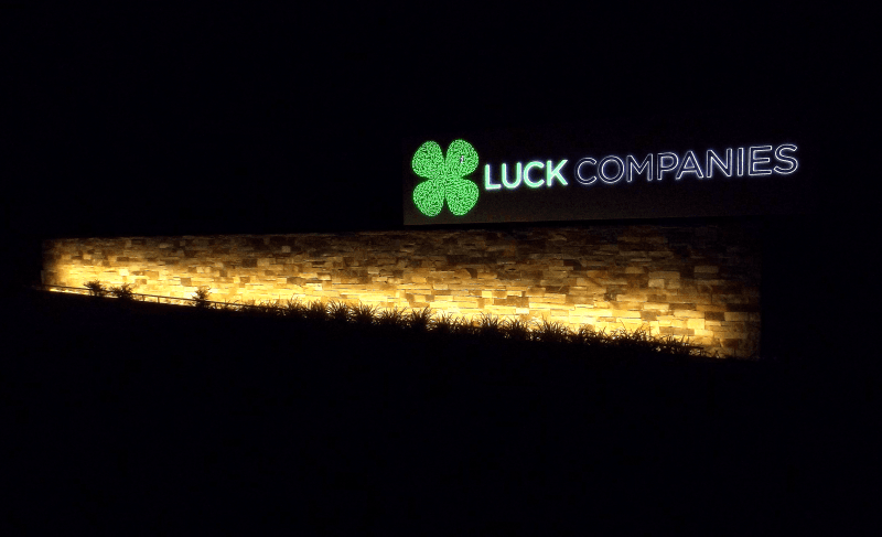
Recently, Goochland County changed their sign setback provision, allowing signs to be 10′ closer to the road. Luck Stone planned to put a new sign on top of a nice wall they would build using some of their product and then landscape around it.
Bob Morin, owner of Holiday Signs, was at a Planning Commission Meeting representing a different client on a case before the Board. Luck Stone’s presentation was deferred because the Board requested more information. We called Luck Stone’s Project Manager the next day to offer our assistance, suggesting that it might be helpful to prototype the sign as a way to explain to the Commission what they were hoping to create. It turned out Luck Stone was working with a design firm with which we’ve done several projects through the years.
COLOR CHALLENGES
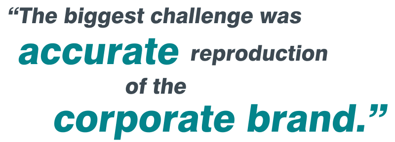
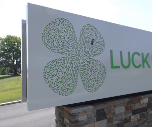 The most technically challenging aspect of the job involved the accurate graphic reproduction of the corporate brand. Luck Stone had just developed a new logo of which they were very proud and wanted it faithfully reproduced on the sign. The logo uses a specific color of green and they wanted it to appear the same during the day as at night.
The sign employs graphics at various surface levels. Translucent vinyl graphics on top of relatively thick-stroked acrylic elements that push-thru the sign faces are at one level. Thin-stroked plastic-backed surfaces behind routed areas in the 1/8″ thick sign faces are at another. Due to the variation in the film’s position on the faces, shadowing and lighting made these elements appear significantly different. We experimented to find the right combination of type and amount of lighting, as well as thickness and color of plastics, vinyl or paint for each element to produce the desired result for both daytime and nighttime viewing.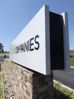
Teaming up with Luck’s designer, John Crank of The 1717 Design Group, we produced several samples and prototypes for review by everyone involved and ultimately, Mr. Luck. The design firm tweaked things based on the samples and prototypes, and we built the sign using the revised design. The recommended design was presented to Mr. Luck as a final prototype. It was closely reviewed and then approved. Mr. Luck and everyone involved with the project were very happy with the end result!
Other Holiday Signs Signage Case Studies:
- MeadWestvaco: Why Use Sign Prototypes?
- Virginia Iconic Signs
- Case Study: Hotel John Marshall
- Historic Restoration Case Study
- Powerful Entrance to a Virginia Mixed Use Development
- Dominion Enterprises: High-Rise Branding
- Connects Federal Credit Union
- Historic Restoration-Altria Theater
- ACAC Fitness Centers
Mark Hackley is an
Account Executive at Holiday Signs
540-416-3154

