The Value of Red


THE VALUE OF RED  I was watchiStreetviewng the last game of the 2013 World Series at Chili’s last night. As I entered the door of the restaurant I walked under a huge, bright red pepper icon that captured my attention from the highway just before turning into the parking lot. I was lucky to get a seat by the biggest digital TV screen in the bar where a young couple just left. (They were probably Cardinals fans since they packed up and left just as the Sox scored their sixth run and were leading 6-0 in the bottom of the fourth.)  I ordered a good appetizer and proceeded to watch the Boston Red Sox clobber the St. Louis Cardinals for the series victory.

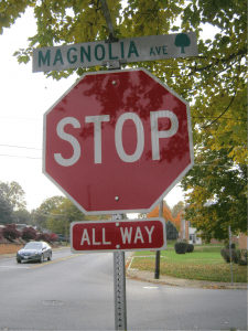
I woke up this morning feeling mostly indifferent about the results of the game since I’m a diehard Baltimore Orioles fan, (sequel poststop sign will be about the value of orange!) I was watching sports clips of the series and noticed all the red. Red, red, red. In daylight or with artificial lighting at night, the color red ranks up there with the most visible colors. If it’s unlit, red is very hard to see at night and appears pretty much as black. Since it’s hard to see unlit red colors at night, “Stop Signs” only became red after reflective paints and films were introduced in the 1950’s. Prior to that they were painted yellow with black letters from 1924-1954, and usually white with green letters before that.
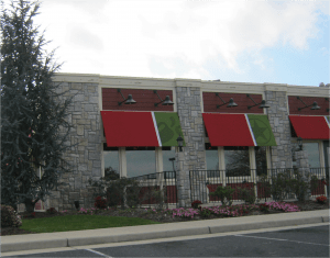
When lit, red is a very noticeable color- especially out in the commercial world on busy streets where stores are competing for attention and the all-important “drive-by” customers. As I drive down the road, red signs really pull in my attention. But the color red also has an emotional value.  Red is a powerful color psychologically. If you’ve had a good day, it drives love and passion (Boston florists will probably have a record week in sales.) If you’re worked up about something, it can drive feelings of war and aggression (the St. Louis crime rate will probably soar this week!) They say red stimulates the appetite; hence a good reason for Chili’s to install huge, bright red peppers on the roofs of their restaurants, and fill their menus with its many shades. In addition to Chili’s, there are dozens of restaurant chains that use red in their marketing programs: McDonalds, KFC, Wendy’s, Pizza Hut, Chipolte, Popeye’s and Five Guys are just seven coming to mind that use some form of red sign.

It’s important to pay attention to sign colo rs as you brand a new business or select a location for your next new store. The value of red goes down when all the stores around you promote their own red brands. Think brand differentiation. If you locate your new store between two prominently red brands and yours is red too, maybe another site between two green brands will help you stand out better!
Count the number of RED’s in my blog!

Now, find the one RED that didn’t get highlighted.

Which is easier?


VISIT OUR WEBSITE

How Can Specialty Sign Lighting Techniques Help Position Your Brand?

www.holidaysigns.com-richmond-lynchburg-va-push-through-letters-signsHALO-LIT AND PUSH-THROUGH
GRAPHICS

How Edge-Lighting Helped Position Two Virginia Brands


October 2013 Push Thru Graphics Newsletter2

In sign design, there are many ways to customize or differentiate a branding message. Through the design process, Holiday Signs regularly consults with its clients to formulate the best sign designs to match their intended brand positioning. Most of our clients want their valuable brands to make above-average impressions on their customers and communities, and sign lighting is one design element frequently used to make high-level branding statements.

 
Two Recent Case Studies with Specialty Lighting Solutions 

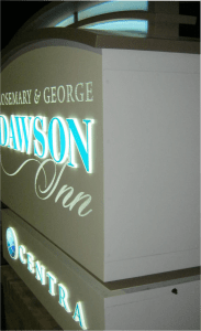
1) After ten years in the making, Centra Health, a regional hospital group in Lynchburg, Virginia, was ready to roll out the name of their new lodging facility on campus: The Rosemary & George Dawson Inn, named after the former Centra CEO and his wife. The new inn filled the needs of a growing number of out-of-town patients and their families by providing lodging for them while being treated at nearby health centers like the Alan B. Pearson Regional Cancer Center. They wanted the new facility’s signage to tie in with their existing sign system while at the same time differentiate the new and unique lodging facility from the rest of the campus.

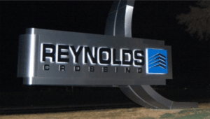
2) Reynolds Crossing, an award-winning mixed-use development in Richmond sought to market its brand at its highly visible entrance. It wanted to leave a definitive impression through iconic signage at its campus style setting by using distinctive design elements to set off its brand in a way that differentiated it from other developments in the area.

In both instances, our clients relied on Holiday Signs to suggest the right specialty lighting techniques for their custom situations. For the hospital we recommended push-through graphics.  Technically speaking, push-through graphics are made by routing out the sign background (sign face) and pushing router-cut graphics, usually made of acrylic, through routed graphic openings. The graphics are flanged at the backs or raised from a whole sheet, and they stay secure in the openings because they are securely cemented and/or mechanically fastened to the back of the aluminum sign faces. Depending on the desired look, the thickness of the push-through graphics can be either the same (flush) or thicker (raised) than the thickness of the face substrate.

For the developer, we recommended a unique and iconic structural desOctober 2013 Push Thru Graphics Newsletter3ign as well as halo-lit graphics, which are opaque, fabricated, dimensional graphics most often back-lit with LED lighting or sometimes lit by fluorescent lamps from within the cabinet.

Signs manufactured with push-through or halo-lit graphics provide an eloquent and sophisticated look for any kind of business or organization.  When the sign is lit, the background is totally opaque and the edge or face-lit letters create a very unique and classic image. Because the backgrounds are opaque and only the graphics light up or are haloed, both halo-lit and push-through graphics have a low impact environmentally. They create high quality signage that is attractive and appropriate for many locations that need to balance visibility needs with aesthetics, and are a great choice for signs facing residential or professional districts where reduced glare and low light emission is important.


Read what others are saying about us!


If you liked this story, here are some others you may like:


Contact:

Mark Hackley, Account Executive

mhackley@holidaysigns.com, 540-416-3154


Printer-Friendly PDF


October 2013 Push Thru Graphics Newsletter footer


Virginia Marquee Sign Restoration in Richmond’s Downtown

www.holidaysigns.com-richmond-virginia-theater-marquee-historic-restoration

CASE STUDY: VIRGINIA REPERTORY THEATER, Virginia Marquee Sign Restoration

How Signage Restores the Glamour of Virginia’s Downtowns

October 2013- Technically Challenging       Historic marquee sign restoration at theaters is one of the few remaining applications for neon lighting and signs, which is gradually being replaced by greener LED lighting technology. “This could be the last big neon job we’ll do,” said Bob Morin, owner of Holiday Signs of Chester, Virginia. Bob was referring to his project for the Virginia Repertory Theater, located in downtown Richmond.

      The Virginia Repertory Theater got its start in 1911 as the November Theater and passed through many hands on the way to its current ownership. It was shut down during the decline of American downtowns which left many areas of Richmond abandoned and empty. Several community theaters in town were underfunded and this project was the result of consolidation of a few of them. Holiday Signs worked with Kjellstrom & Lee and Commonwealth Architects on the job. Competitive pricing and experience with historically-true renovations were the main reasons why Holiday Signs was awarded the contract.

Restoring the Glitz

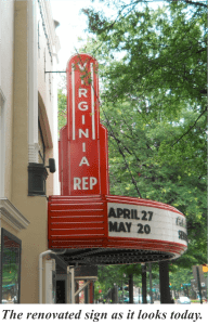
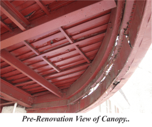
The biggest challenge of the project involved accurately restoring the theater’s signage to its original glory. The theater was still using the old, dilapidated marquee. It was rusted and falling apart. Part of the requirements of receiving HUD funding for renovations was that restorations had to be historically accurate. The general contractor had stripped the old skin down to the bare structure and getting a good fit for the radius surface of the marquee was difficult. The building’s framing was hand built back in the days when lumber sizes varied from board to board. There were many inconsistencies and over the course of a century, many things were out of line. “It’s hard to build a sign of that size with a radius working in modern conditions, but even harder as a renovation,” explained Wade Gentry, production manager at Holiday Signs.

Backup_of_Blog Blurbs22Another challenge was related to the urban setting of the theater. Sight lines and viewing considerations for downtown signageOctober 2013- Technically Challenging projects differ from projects in other areas where there is much more room and distance around the sign to the viewer. Because urban signs are in closer quarters, there has to be more attention to detail. The marquee and sign above was only part of the entire project. In addition to the marquee, there was also a large flag-mounted sign, signs for the neighboring theater space and donor recognition signage.

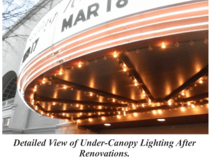
Lighting involved with the sign renovation was extensive. The curved surface reader-board originally had skeleton neon tubing all around it which was brought back to life in the restoration process. The lighting under the canopy of the marquee had 500′ of light bulbs and the new entrance way to the theater has been described as both “quaint” and “cool” at the same time. Phil Whiteway, the theater’s managing director, loves the sign. “It lights up West Broad Street like a beacon of vitality,” he said. “We’re really happy with the outcome of the whole project! The name change was very important to us and the sign was laudable and a very important element of our re-branding and historic renovation.”


October 2013- Technically Challenging October 2013- Technically Challenging October 2013- Technically Challenging


Contact: Mark Hackley, Account Executive
mhackley@holidaysigns.com  (540)416-3154


Click for more Technically Challenging Case Studies


If you liked this, you may also like:


 printer friendly icon


TECHNICALLY CHALLENGING  OCTOBER 2013    KEY INDUSTRY APPLICATIONS: DEVELOPERS/THEATERS/RETAILERS

Would You Like to Increase Your Tenants’ Visibility?

www.holidaysigns.com-richmond-va-daktronics-watchfire-digital-LED-signs

WOULD YOU LIKE TO INCREASE YOUR TENANTS’ VISIBILITY?

Savvy developers are employing Electronic Message Centers to grow their customer base and drive traffic to their tenants’ stores.


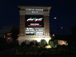
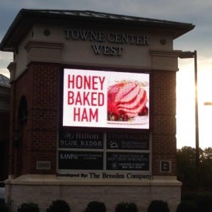
Holiday Signs recently added two large full-color Electronic Message Centers (EMC’s) to an existing double-faced entrance pylon at Towne Center West, a Lifestyle Center owned by Breeden Companies. It is located next door to a 1.3 million square foot Super Regional Center, so competition for shoppers is intense.

Prior to the addition of these EMC’s, most of the inline tenants had limited visibility to the 25,000+ cars that pass by the center each day. These tenants had spent countless advertising dollars to draw customers into their shops, but that only produced limited results. Breeden, anxious to help their tenants increase their visibility and draw in new customers, hired Holiday Signs to evaluate their center.HoneyBaked Blurb

Holiday Signs specializes in helping developers and shopping center management revitalize the signage for their centers. Many times they recommend updating signage with updated design, new graphics, tenant panels or fresh paint but in this case the main identification sign was only a few years old. A thorough analysis suggested the addition of two new EMC’s to the existing pylon would give the tenants their much needed visibility.

Once the EMCs were in place and the messages started rolling, tenants began to see an immediate increase in traffic to their stores.

Electronic Message Centers are the most effective way to increase traffic for retailers.

 “The advertising sign is working great for us,” said Kathy Crawford co-owner of HoneyBaked Ham. “HoneyBaked Ham has seen double-digit increases since the digital sign was installed,” chimed in her husband and co-owner, David Crawford. He said it’s even better that the HoneyBaked Ham corporate office provides digital content for the sign.

Steady Stream of Advertising Revenue for Landlords


Adding an EMC to your signage package is a great way to attract new tenants while retaining existing ones. Many retailers see value in having their message prominently displayed to potential customers and most will gladly contribute a portion of their marketing budgets to reach them. Landlords understand the value of utilizing EMC’s as revenue generators because they are now able to charge their tenants for the number of messages they run each day, week or month. Compared with radio, television and direct mail, the cost per thousand is lower and infinitely more effective that other forms of advertising.

Plus, now is a great time to go digital! EMC’s are considered depreciable equipment and the American Taxpayer Relief Act offers significant tax benefits for equipment purchased in 2013.


Read a similar story of how another US shopping center uses EMC’s.October 2013 Digital Messaging-Shopping Center EMC's


If you liked this blog, you may also like these:


PRINTER-FRIENDLY PDF


Article Written By:

Jonathan Dabney, Account Manager, (804)543-1583

jdabney@holidaysigns.com

Mark Hackley, Account Executive, (540)416-3154

mhackley@holidaysigns.com


October 2013 Digital Messaging-Shopping Center EMC's Footer

What is the Cocooning Effect?

www.holidaysigns.com-richmond-va-cocooning-effect-affect-wayfinding-signage

What is the “Cocooning Effect?”

If You Care About Branding, You Need to Know


Roanoke Airport Wayfinding Photo  What is it about the feelings we get when we’re in a comfort zone? Consider this situation: We need to be at an evening meeting at a building on a campus we’ve never been to before and it’s raining. Our GPS leads us to the right parking lot, confirmed by the branding signs we saw upon entering the parking area. We exit our car and follow the well placed illuminated signs at the pedestrian walkway to the conspicuously branded building entrance. We walk into the lobby area and a nice kiosk directs us to the third floor. Upon leaving the elevator, an interior wall directory leads us to the right hallway.

  When we arrive at the conference room on time for the meeting, we are greeted by a wall sign that identifies the room and the meeting, confirming we’re at the right place. We join the meeting feeling good about our experience so far. Even though it’s a dark and gloomy night, it’s almost like we’ve been in a protective bubble since entering the property and it has left us with warm and fuzzy impressions. We call this the “Cocooning Effect.”

john tyler  Joseph Forgas, a social psychologist and fellow of the American Psychological Society, says emotion or affect has been found to influence human cognition and that affect has been shown to effect our rational thinking, information processing, memory, reasoning, judgment and decision making. When relating these research findings to wayfinding, we can see why there are certain places we enjoy going, and certain places we do not.

  So what are some of the things in a wayfinding system that could have positive emotional impact on our thinking? It’s all about brand image. Effective wayfinding plays a big part of the overall brand message, with well-placed, legible and easily interpreted signage incorporating consistent themes, colors and materials, both inside and outside, which eliminates, or at least minimizes, frustration of not knowing where to go, how to get there or being late for appointments.

  The degree to which an organization executes day-to-day operations in support of that brand image is one of the primary reasons a customer might choose to do repeat business. The best wayfinding systems tend to make the total customer experience as pleasant and trouble-free as possible.

  It’s clear that the value of wayfinding systems exceeds just words and directional arrows. Whether it’s for a hospital, an airport, a university, an office park, a shopping center, an amusement park, or a government complex, signage systems should be designed with the overall customer experience in mind; and the “cocooning effect” encompasses all aspects of facilities that impact a person’s comfort level, not just the signage. In that respect, wayfinding systems should rank with architectural design, landscaping, heating, cooling and plumbing systems, internet service, lighting, and security, which all work together to create a cocooning effect at a facility. They all form an organization’s overall brand, elevating people to a level of comfort they will cognitively remember and share with others.


Mark Hackley is an account executive at Holiday Signs, 540-416-3154.


printer friendly icon


If you liked this article, here are some more that may be of interest:


Adding Message Boards to Signs: Why Digital is the Best Choice

www.holidaysigns.com-richmond-va-daktronics-watchfire-digital-LED-signsADDING MESSAGE BOARDS TO SIGNS

Why Digital is the Best Choice…

ADDING MESSAGE BOARDS TO SIGNS

Have you ever made a spontaneous retail purchase? I recently bought a dozen roses for my wife from a retailer I never knew because a digital sign told me they were on sale and it happened to be our anniversary. For that reason, I know personally that digital advertising works, and I know I’m not the only one who makes spontaneous purchasing decisions.
Backup_of_Blog Blurbs 10-1Academic studies back this up, showing that 50-60% of on-premise purchases are spontaneous. The Pratt Retail Institute, an organization involved in research and consulting work related to retail marketing, says that spontaneous purchase rates of more than 50% should affirm adding message boards to signs.

Businesses that utilize some form of changeable message system already know roadside messaging works. Of all changeable message systems, upgrading to digital makes the most sense because digital messaging offers the highest level of visibility and on-going attention, aesthetics, message changeability and adaptability for targeted marketing strategies.                                                        

Message Boards Before and AfterPhotos courtesy of Daktronics, Inc.

Most Common Forms of Changeable Message Systems:

  • Digital Signage
  • Manually Changeable Sign Boards
  • Banners

Of all the examples listed above, only digital messaging has the lowest daily cost and highest flexibility when displaying multiple different messages on a daily basis. Many times people with existing manually-changeable signs approach us to convert them to digital boards as there are many advantages in doing so.

Here are the top 10 reasons to upgrade to digital:

1) Digital Messaging provides multiple, customized messages to reach diverse demographic groups with a variety of goods and services;
2) The movement and brightness of digital gets more attention;
3) 50-60% of consumers make last minute purchase decisions and digital ups the chances to reach them with the right message at the right time;
4) Digital Messaging creates new advertisements quickly and inexpensively;
5) Viewers can understand an image much more quickly than words;
6) With digital you don’t have to worry about employee safety as copy is updated in parking lot traffic or bad weather;
7) Digital software is equipped with spell check features so no embarrassing misspelled words in public;
8) No worries about not having enough letters for the messages you want;
9) With digital the wind won’t blow letters off your message;
10) Ability to pre-schedule messages and not worry about who’s going to change the sign.

Holiday Signs regularly retrofits existing manual marquees to digital message boards. The process involves a call or visit from a project manager to assess each custom situation. We check codes, survey the existing support structure and assess viewing angles and distances to suggest the right size unit and pixel pitch for the site. The project manager asks questions about the content to be displayed and will make further recommendations for what is best. (See ABC’s of EMC’s for more information about digital messaging.)

Once the exact needs are assessed and our proposal is accepted, the project is scheduled and software training is conducted before the digital sign is installed. During installation, technicians remove and dispose of the existing marquee(s) and replace with new digital unit(s). Most customers see results immediately or shortly after the upgrade.


Contact: Mark Hackley, Account Executive

mhackley@holidaysigns.com  (540)416-3154


Printer-Friendly


  • More Digital Messaging Signs Stories:

Case Study: Towne Center West’s Digital Advertising Sign

Case Study: Green Top Sporting Goods’ Electronic Message Center on I-95

Using Co-op Dollars to Fund Digital Signage

Using Digital Signs to Connect with the Community

10 Reasons to Upgrade to On-Premise Digital Advertising


Here are other Articles You May Like:


Case Study: Towne Center West’s Digital Advertising Sign

Case Study: Green Top Sporting Goods’ Electronic Message Center on I-95

Using Co-op Dollars to Fund Digital Signage

Using Digital Signs to Connect with the Community

10 Reasons to Upgrade to On-Premise Digital Advertising