How Small Signage Features add Big Punch in Retail Repositioning
Rockwood Square Shopping Center
How Small Features add Big Punch to Signage and Retail Repositioning
We worked with AREA Properties, LLC of Rockville, Maryland, who recently renovated the Rockwood Square Shopping Center in Chesterfield County, Virginia. Prior to its makeover, the center had a high vacancy rate, but after all the renovations it is now 98% full, much of which is attributed to the new signs according to Gary Modjeska of AREA Properties. “Signs were a very, very important part of the repositioning of the property,” he said.
 Since the property was not a high end shopping center, the client wanted signage that would not be real expensive to potential tenants. Gary worked with Holiday Signs project manager, Allen Twedt, to come up with a new design for the center’s signs. Before renovations, the center had plain, rectangular-shaped box signs with flat faces and poor hodge-podge designs. The client originally planned to replace everything with channel letters but asked us what we thought. We told him we could come up with a nice design for box signs that would include some architectural amenities, and if there is a tenant change all that would need to be done is swap out a new face, keeping a new tenant’s costs down in the future versus them having to come up with money for a new set of channel letters.
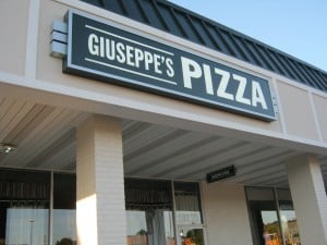
Allen and the Holiday Signs design team utilized an interesting lighting sconce detail for the box signs and the main pylon that tied all the signage together. The detail also appears on the under-canopy signs as well. The owner also liked the idea of keeping all the tenant signs consistent and uniform regarding colors and layout. The sign backgrounds are opaque, so at night all that is seen is the copy and the lighted sconces giving the retail center a classy look instead of the typical image portrayed by standard illuminated white-background box signs. Adding the simple architectural details and keeping all signs consistent in design supports a unified theme that is attractive to customers and has helped the center grow and thrive again after the re-imaging.

Sconce detail on the wall signage. By utilizing box cabinet signs for the center’s tenants versus channel letters, it makes them all consistent, easier to change, and less expensive than custom channel letters. If not a high end property, lower up front costs attract and keep more long-term tenants, and there are many creative ways to keep costs down while promoting a consistent and eye-catching sign design.
This was the first project we provided for Gary at AREA Properties, LLC, but he said he will use us again on future projects because he was so pleased with all aspects we provided him.
Contact: Mark Hackley
mhackley@holidaysigns.com (540) 416-3154
Other Articles You May Like:
Roanoke Airport’s new Wayfinding System


