Richmond Sign Company Builds Big Signs that Build Big Brands!

HOW DO YOU CAPTURE AND KEEP YOUR CLIENT’S ATTENTION?
The Value of Iconic Signs
In the same way signs help Coca-Cola and McDonalds set themselves apart as iconic international brands, two area developers have contracted our services to erect iconic signs at their highly visible commercial developments.
BIG CATCH!
The Winding Brook Development, located on I-95 in Hanover County, is becoming a retail hot spot. Holiday Signs provided an eye-catching entrance monument there several years ago as the new retail center developed. The twenty-seven foot high sign touts a fourteen foot high fiberglass fish promoting the cornerstone tenant, Bass Pro Shops. Two large metal signs mounted to its stone base identify the development as Winding Brook, and along with the big fish sculpture, create an unforgettable icon that provides:
- Immediate Customer Attraction
- Long-Term Brand-Building Results

COMMERCIAL SCULPTURE
Collaborating with the developers of Reynolds Crossing, a retail and medical office park off I-64, we created a unique entrance sign. The finished sign, taking the form of a large modern sculpture, conveys the corporate brand and took the ideas and workmanship of a talented staff to complete. A small-scale prototype was produced prior to manufacture so both the customer and the craftsmen understood the ultimate outcome. Being able to manufacture the complex compound curves of the sign’s design elements without a flaw was truly an art that few area sign companies can achieve. The iconic sign:
- Impacts passengers of 36,000 vehicles daily
- Impresses millions over its lifetime due to its enduring and eye-catching design
THINK BIG!
 Scientific studies show that the few select brands considered iconic enjoy a 58% top-of-mind awareness for customers versus a 36% awareness for those considered just strong brands.
- Iconic Brands become “super-familiar” versus just “familiar”
- “Super-familiar” brands are more likely to be considered for purchase over competing “familiar” brands
Signs as part of a company’s regional branding efforts can become icons very quickly. With over 8 million sets of eyeballs right here in Virginia it pays to think big!
Contact: Mark Hackley, mhackley@holidaysigns.com
Account Executive, Holiday Signs 540-416-3154
Click Here for More Technically Challenging Sign Project
![]()
Here are some other articles of interest about signage in VA, MD, DC and NC:
- Technically Challenging Sign Projects
Case Study: Hotel John Marshall
Historic Restoration Case Study
Powerful Entrance to a Virginia Mixed Use Development
- Branding & Wayfinding Signs
Roanoke Airport’s new Wayfinding System
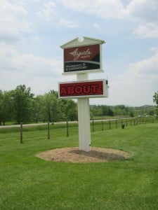
Re-Branding a Retirement Community
- Digital Messaging Signs
Case Study: Towne Center West’s Digital Advertising Sign
Case Study: Green Top Sporting Goods’ Electronic Message Center on I-95
Using Co-op Dollars to Fund Digital Signage
Using Digital Signs to Connect with the Community
10 Reasons to Upgrade to On-Premise Digital Advertising
- General Signage
6 Reasons to Retrofit Neon to LED
Consideration of Sunlight and Shadow in Signage Design
Consideration of Viewing Angle in Signage Design
How Can Specialty Sign Lighting Techniques Position Your Brand?